UX/UI Case StudyHomizy
Home Service Booking App
Homizy is a mobile app concept that helps homeowners find, compare, and book trusted home service providers with clearer pricing, availability, and provider information.
Project Overview
Homizy is a mobile app concept designed to help homeowners find, compare, and book trusted home service providers. The goal was to reduce uncertainty around pricing, availability, provider reliability, and booking confidence.
Role: UX/UI Designer
Duration: 4 weeks
Tools: Figma, FigJam, Google Forms
Project Type: Mobile app case study
The Problem
Finding reliable home service providers can feel uncertain and time-consuming. Users often struggle with unclear pricing, limited provider information, inconsistent availability, and a lack of trust signals before booking.
Research Insights
I conducted 4 user interviews to understand how people find, compare, and book home service providers. Participants included homeowners, a first-time homeowner, and a renter with experience booking services such as yard work, garage door repair, lawn care, and cleaning. The goal was to identify common pain points around pricing, trust, scheduling, reliability, and service protection.
Key Findings
• Users wanted clearer pricing before contacting a provider.
• Users needed stronger trust signals, including reviews, experience, verification, and previous work photos.
• Users expected to compare providers by price, rating, availability, and reliability.
• Users wanted the booking process to feel faster and more predictable.
Design Goal
Design a mobile booking experience that helps users quickly compare home service providers, understand pricing and availability, and feel confident choosing a trustworthy provider.
Design Process
I started by mapping the user flow and information architecture to clarify how users would move from service discovery to provider comparison and booking. Then I created paper wireframes and digital wireframes to explore layout, navigation, and key decision points.
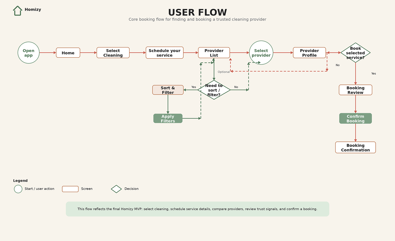
User Flow
This user flow maps the core booking path and decision points, including provider comparison, sort and filter options, provider profile review, and booking confirmation.
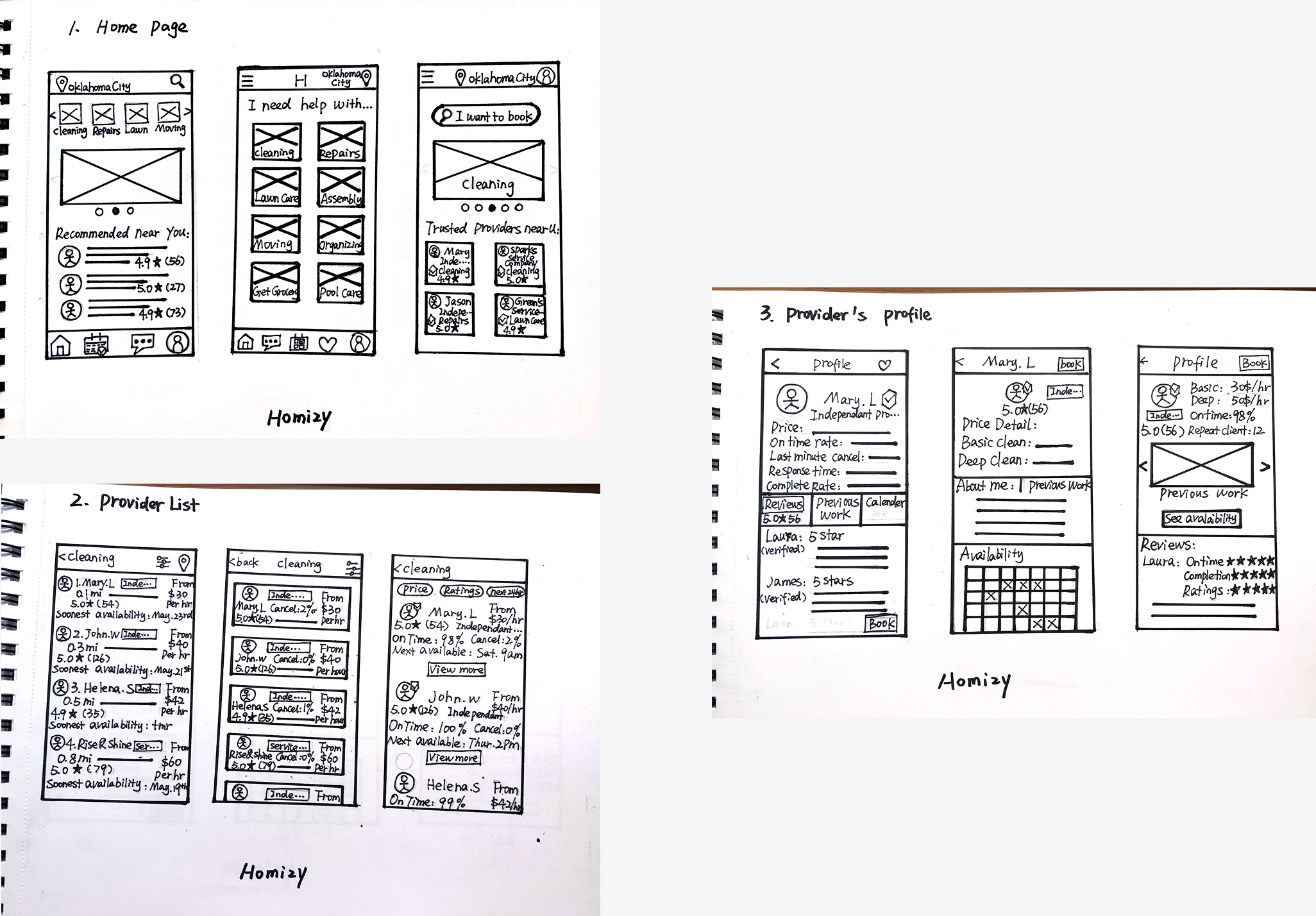
Wireframes
I explored early layout ideas through paper and digital wireframes, focusing on service discovery, provider comparison, and a clear path to booking.
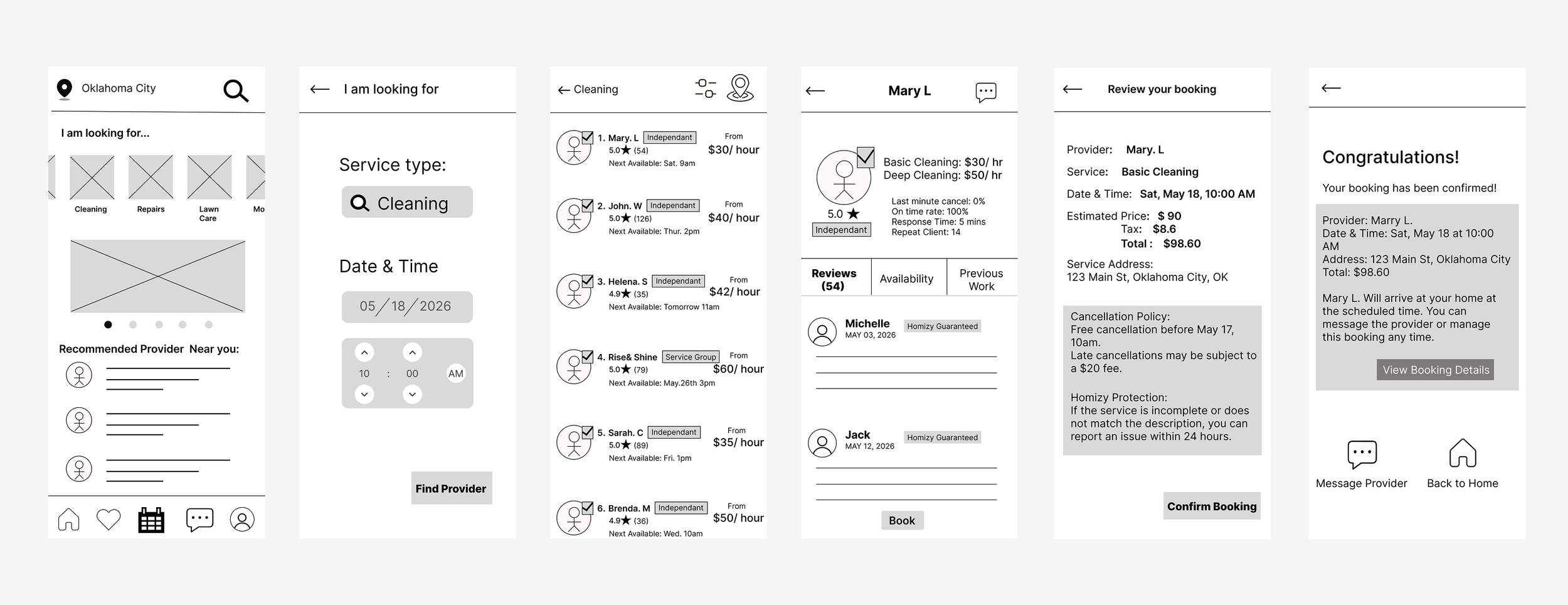
Digital Wireframes
Paper Wireframes
Usability Study & Iterations
I conducted a usability study with 5 participants to evaluate whether users could understand the booking flow, compare providers, and complete a booking with confidence. The feedback helped identify interaction issues and opportunities to improve clarity.
Key changes after usability testing:
Iteration Flow
• Added sort options for price, rating, availability, and reliability.
• Made the entire provider card clickable and added a clear “View Profile” button.
• Made home entry paths more consistent and showed search criteria on the provider list.
• Changed the search section label to “What service do you need?”
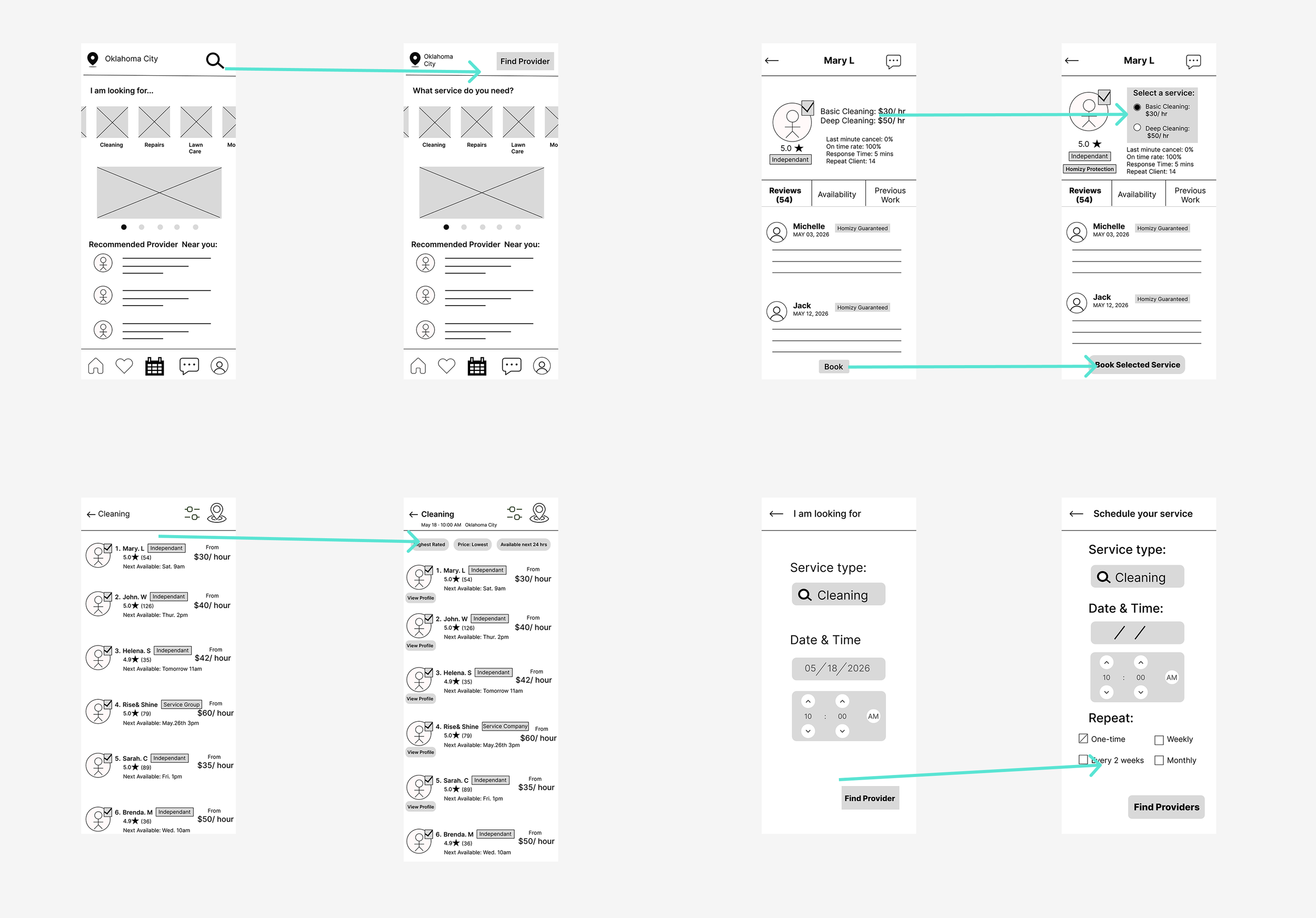
This flow shows how the booking path was refined after usability testing, especially around provider comparison, service selection, and the path from browsing to booking.
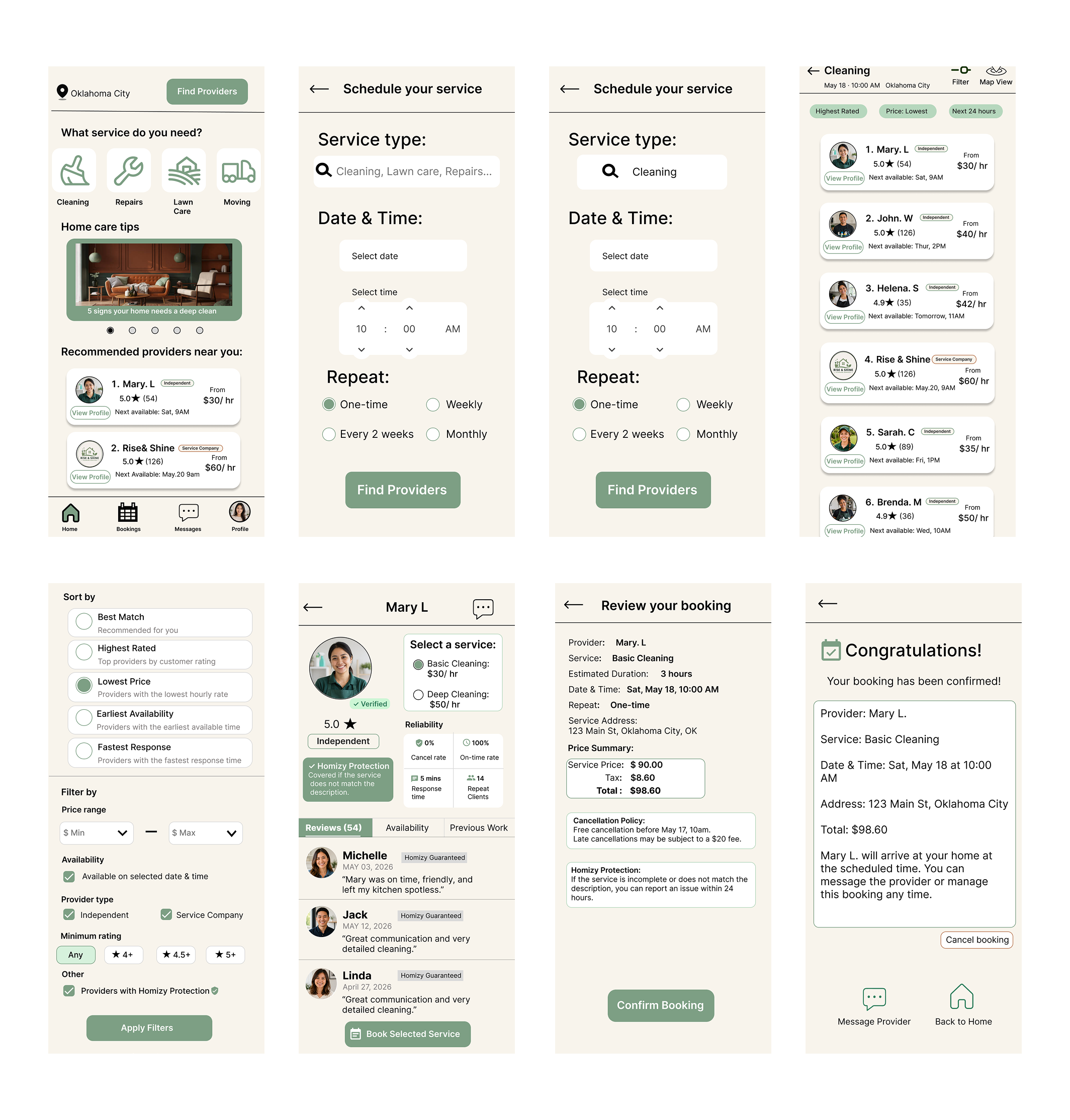
Final Design
The final design focuses on helping users compare providers, review trust signals, select a service, and complete booking with more confidence.
Takeaways
This project helped me understand how trust, clarity, and comparison tools can reduce user uncertainty in service booking. Through usability testing, I learned that small interaction details, such as making provider cards easier to open and clarifying entry paths, can significantly improve the booking experience.
If I were to continue this project, I would further test the service selection flow, refine provider verification details, and explore how recurring bookings could support repeat services like cleaning and lawn care.