FurEver
A responsive pet adoption platform designed to help people discover, compare, and connect with adoptable pets from verified shelters.
UX Research · Responsive Web Design · Accessibility · Prototyping
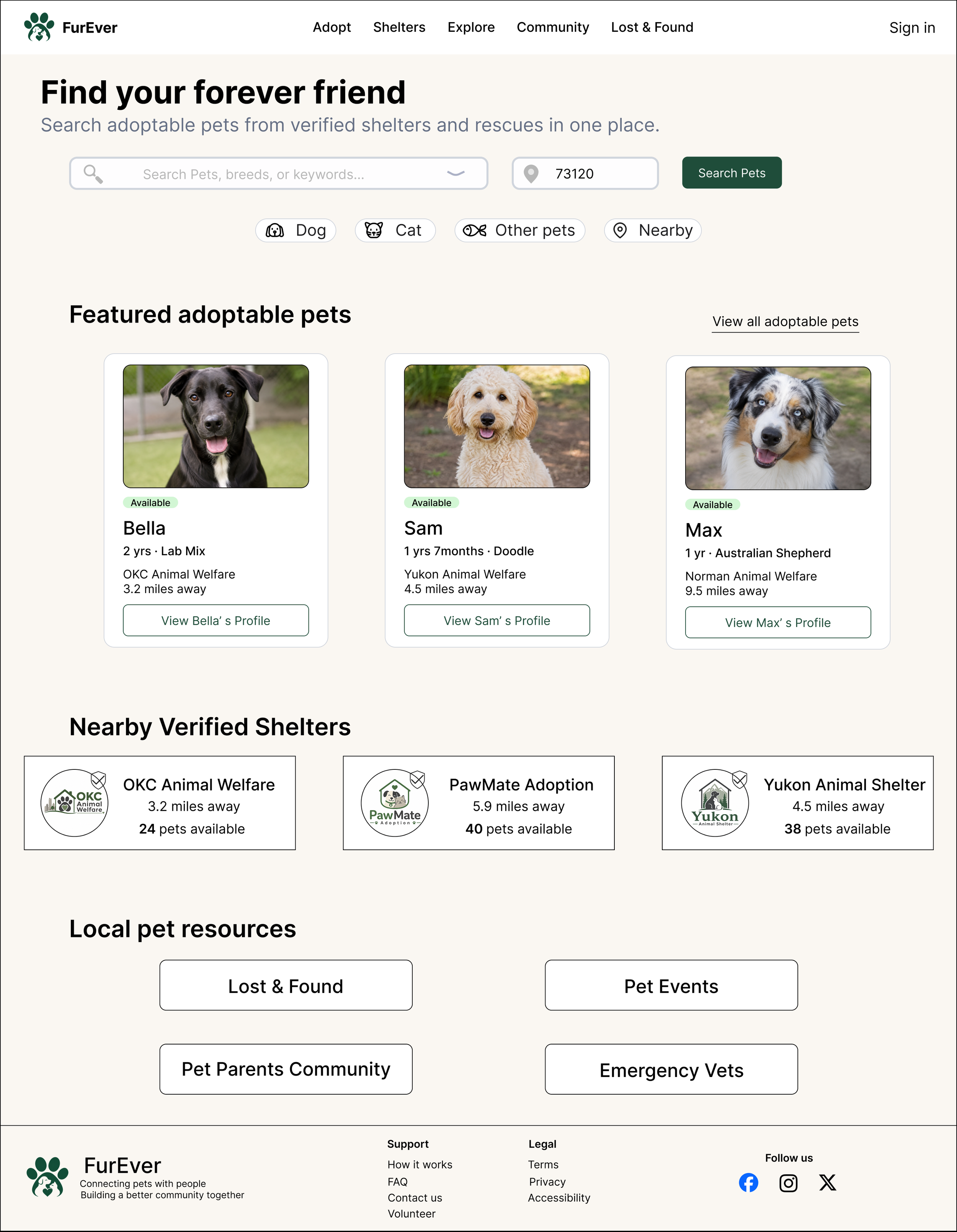
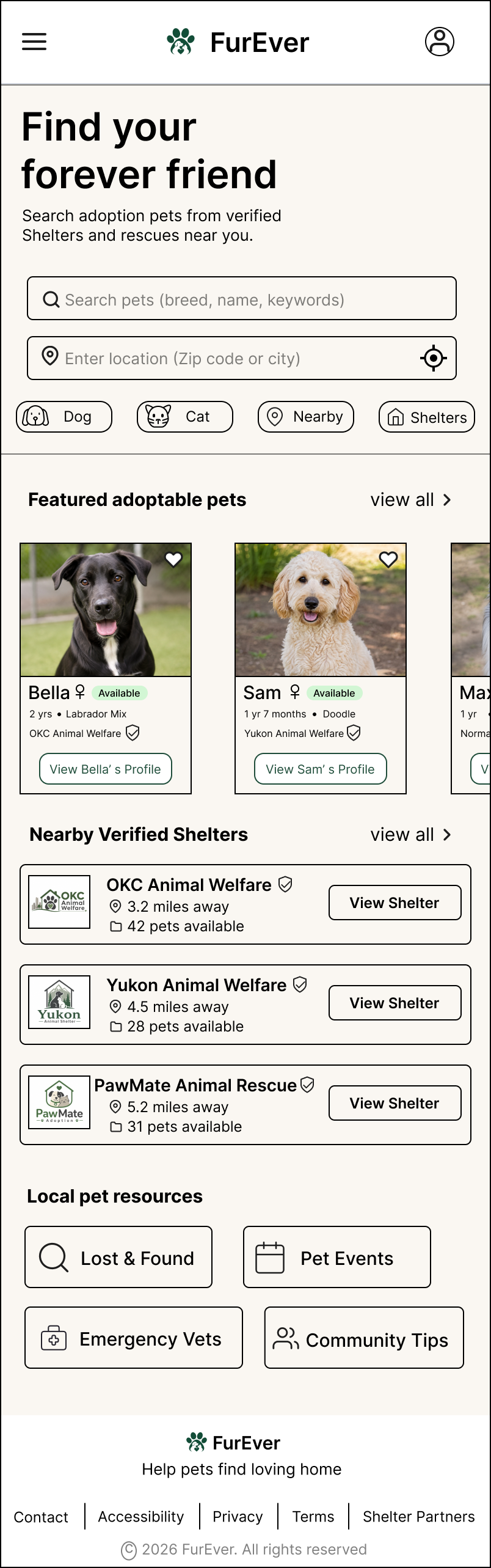
Project Overview
FurEver is a responsive pet adoption platform that brings adoptable pets and verified shelters into one centralized experience. The platform helps users search, compare, evaluate pet compatibility, and schedule meet-and-greets while providing clear health, shelter, and adoption information.
Key Responsibilities
User research · Information architecture · Wireframing · Prototyping · Usability testing · UI design · Accessibility
My Role
UX Designer
Timeline
2026
Platform
Responsive Web · Desktop & Mobile
Tools
Figma · Squarespace
The Problem
Pet adoption information is often scattered across individual shelter websites, social media pages, and third-party listings. Users may struggle to compare pets, confirm health and availability information, or understand the next steps in the adoption process before visiting a shelter.
Scattered Information
Pet profiles, shelter details, health records, and availability are often spread across different sources.
Hard to Compare
Potential adopters have limited ways to compare pets by age, personality, compatibility, and practical needs.
Unclear Adoption Process
Users may not know what documents they need, whether a pet is still available, or what happens after they express interest.
How might we create a trustworthy, accessible experience that helps people discover, compare, and confidently move forward with adopting the right pet?
User Research
I conducted interviews with 4 participants who had experience adopting pets, searching for shelters, or considering adoption. The goal was to understand what information people need before contacting a shelter and what creates hesitation during the adoption process.
01 — Trust comes first
Users wanted clear evidence that shelters and rescue organizations were legitimate and verified before sharing personal information or starting an application.
03 — Users want to compare before deciding
Participants wanted an easier way to compare pets by personality, age, compatibility, location, and practical needs without opening multiple pages.
02 — Health information matters
Age, vaccination status, health records, and medical history strongly influenced whether users would consider meeting a pet.
04 — Avoid wasted trips
Users wanted up-to-date availability and the ability to schedule a meet-and-greet before visiting a shelter.
Research takeaway: Users were not simply looking for more pet listings. They needed trustworthy information, better comparison tools, and a clearer path from discovery to meeting a pet.
Persona
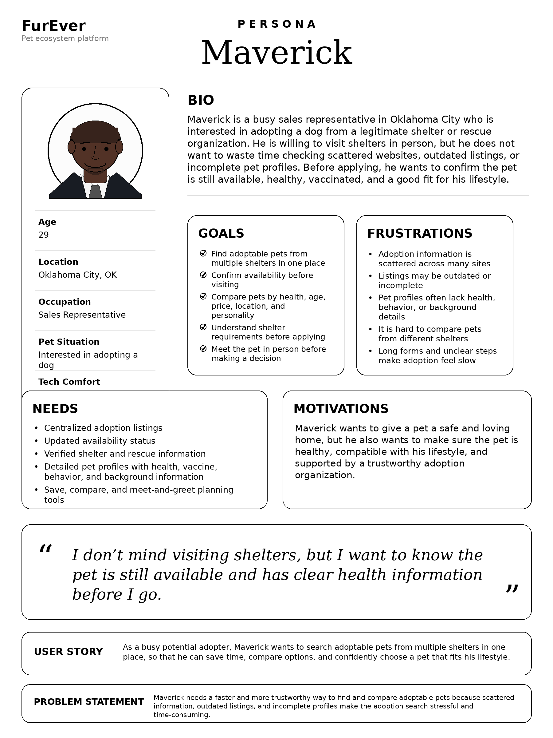
Maverick
Sales Professional
Maverick wants to adopt a dog that fits his lifestyle, but needs trustworthy health information, clear compatibility details, and an efficient way to compare options before visiting a shelter.
Goals
Find a healthy pet that fits his lifestyle
Compare pets without opening multiple listings
Confirm availability before visiting a shelter
Frustrations
Inconsistent information across shelter websites
Unclear health and vaccination records
Time wasted contacting shelters about unavailable pets
Needs
Verified shelter information
Clear pet health and compatibility details
Comparison and meet-and-greet scheduling tools
User Journey
Mapping Maverick’s journey revealed that the biggest friction happened between discovering a pet and feeling confident enough to contact the shelter.
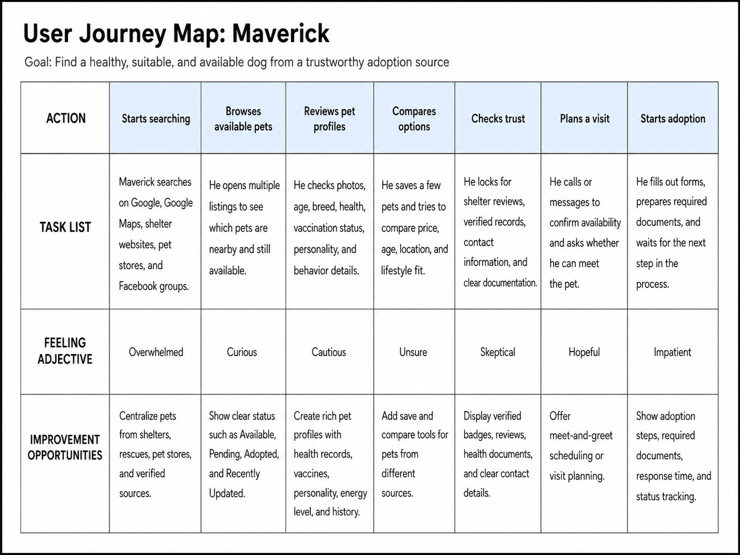
Design Opportunities:
1. Build trust early
Show verified shelters, health records, vaccination status, and clear availability.
2. Make evaluation easier
Allow users to filter and compare pets based on lifestyle and compatibility.
3. Reduce uncertainty before visiting
Provide transparent shelter information and meet-and-greet scheduling.
4. Clarify what happens next
Explain required documents and the adoption process before users commit.
Define the Experience
Based on the research findings, I organized the experience around three core user needs: finding relevant pets quickly, evaluating whether a pet is a good fit, and moving confidently from discovery to an in-person meeting.
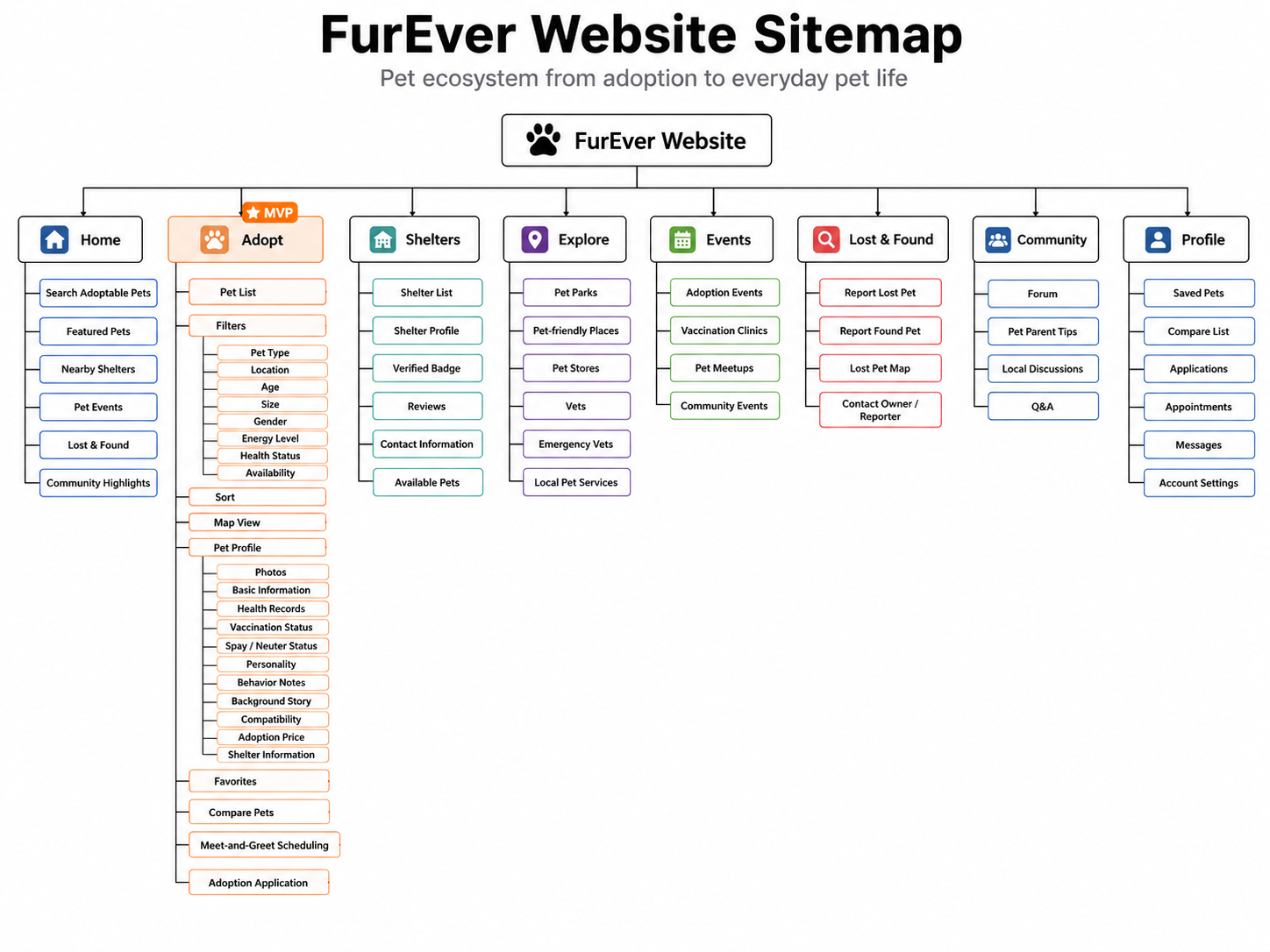
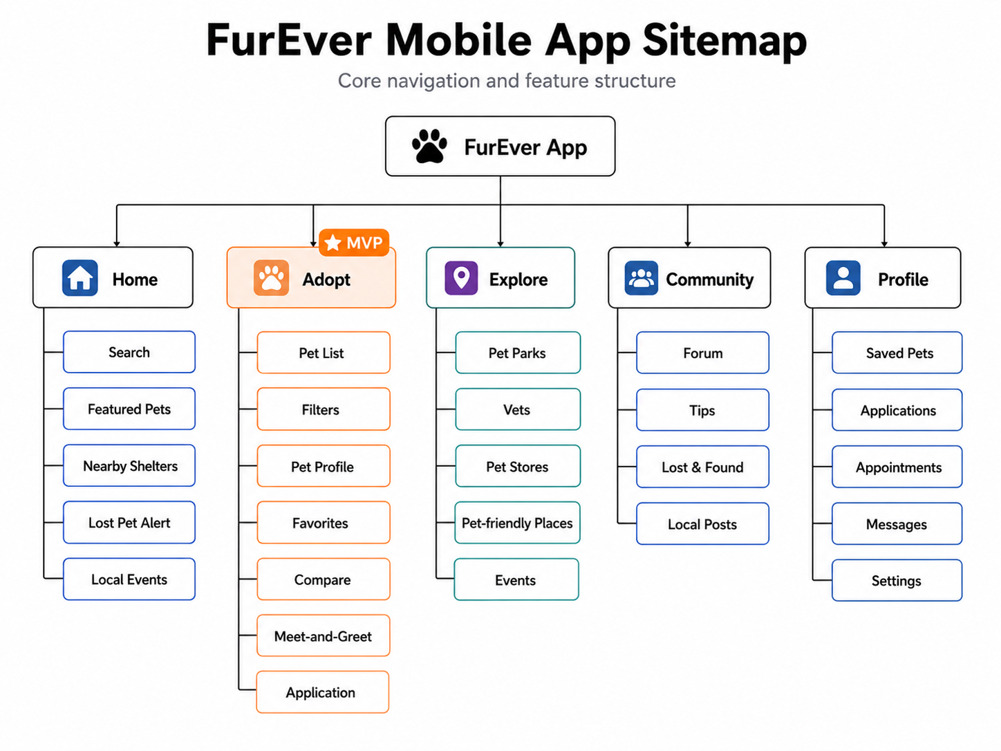
Information Architecture
I structured the site to keep pet discovery at the center while making shelter information, comparison, community resources, and adoption actions easy to reach.
Key User Flow
The primary flow follows a user from discovering an adoptable pet to scheduling a meet-and-greet.
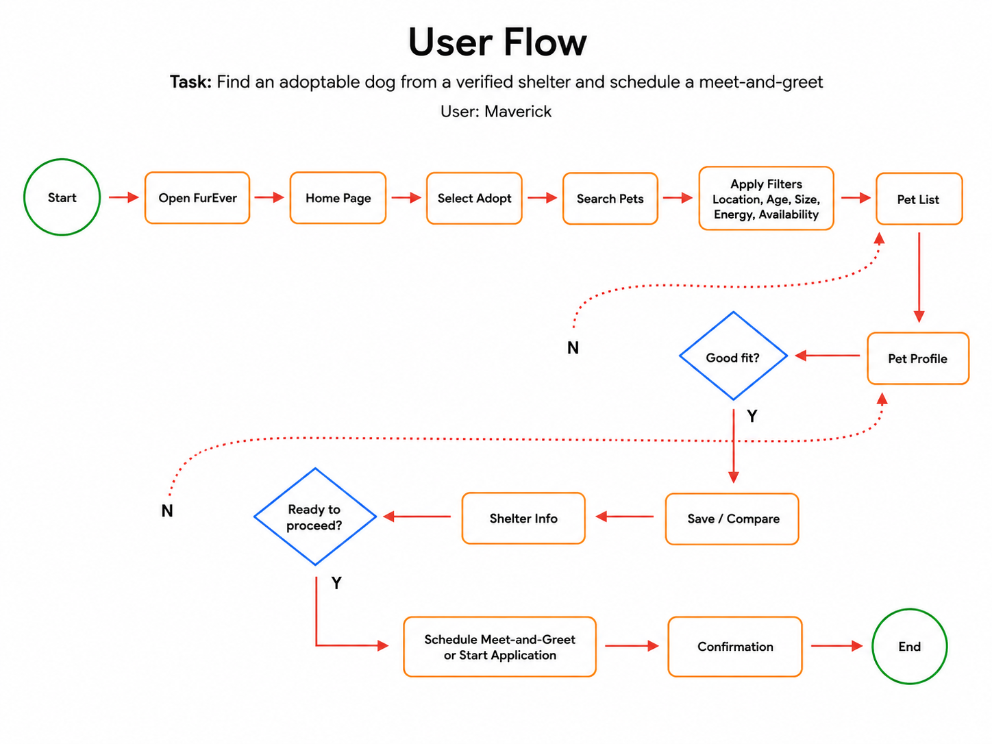
Search & Filter → Browse Results → View Pet Profile → Compare Options → Schedule Meet & Greet → Confirmation
Early Design & Wireframes
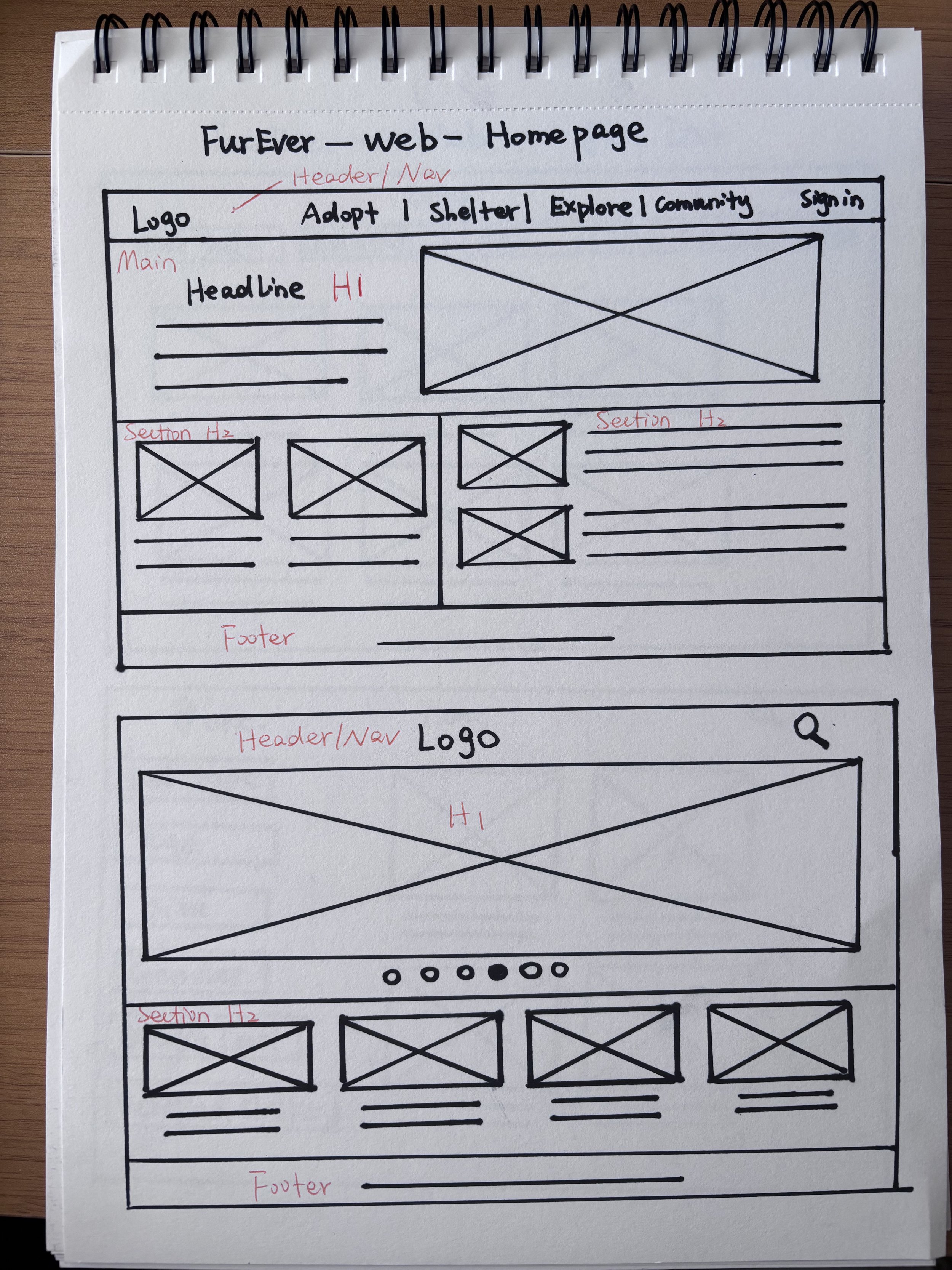
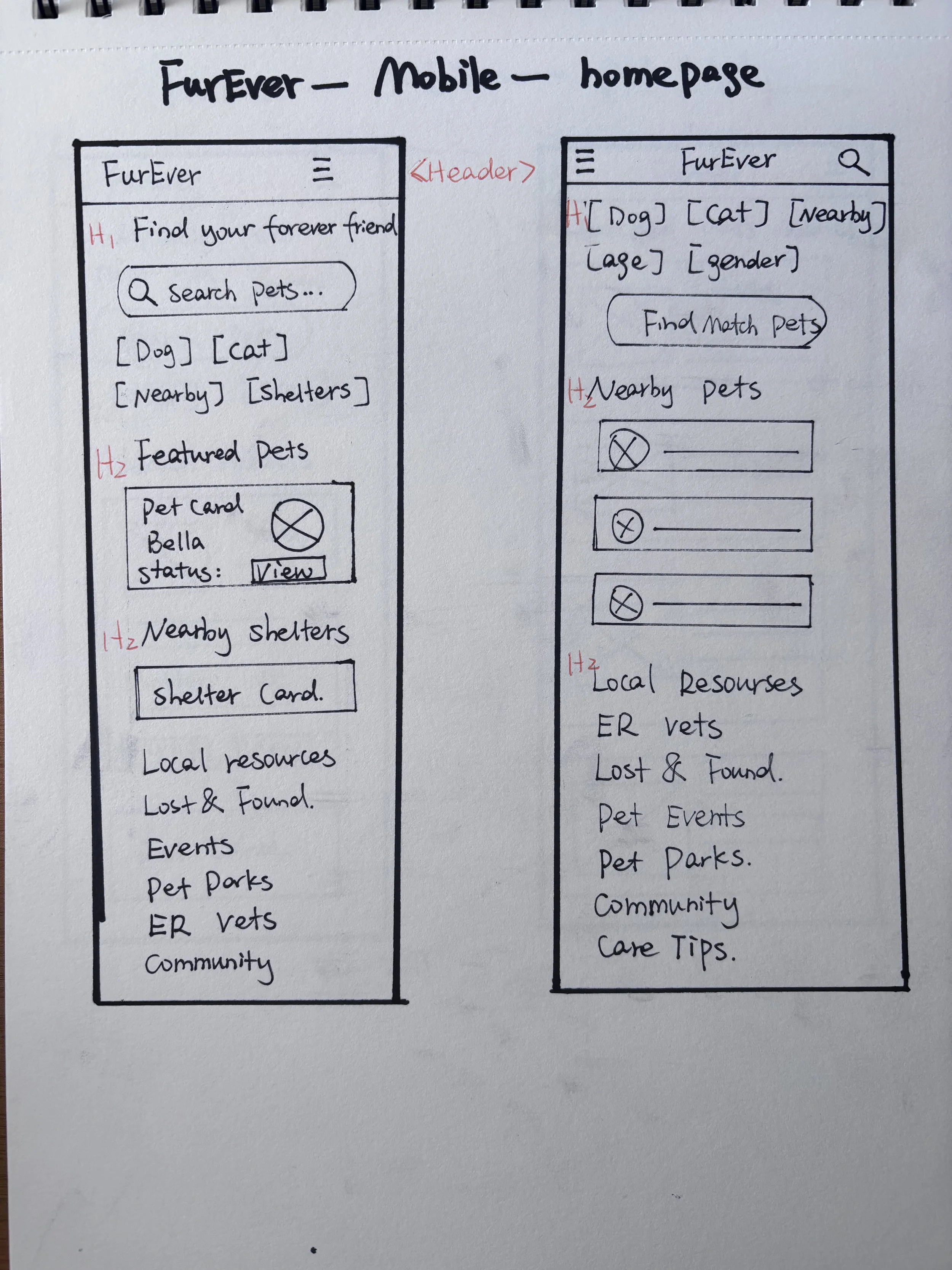
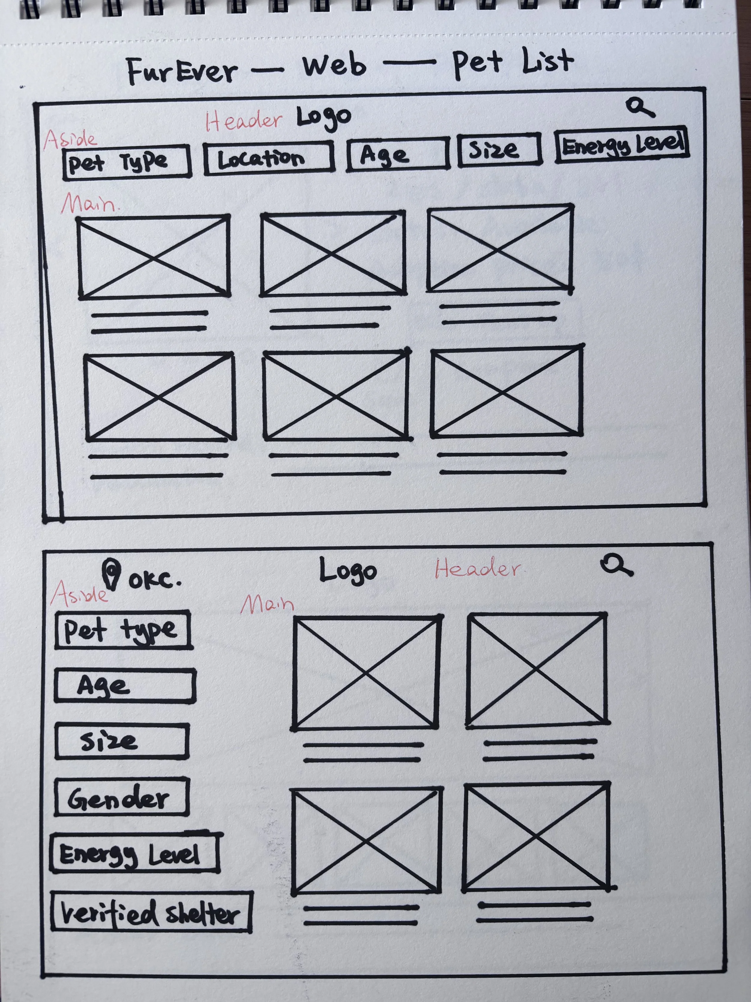
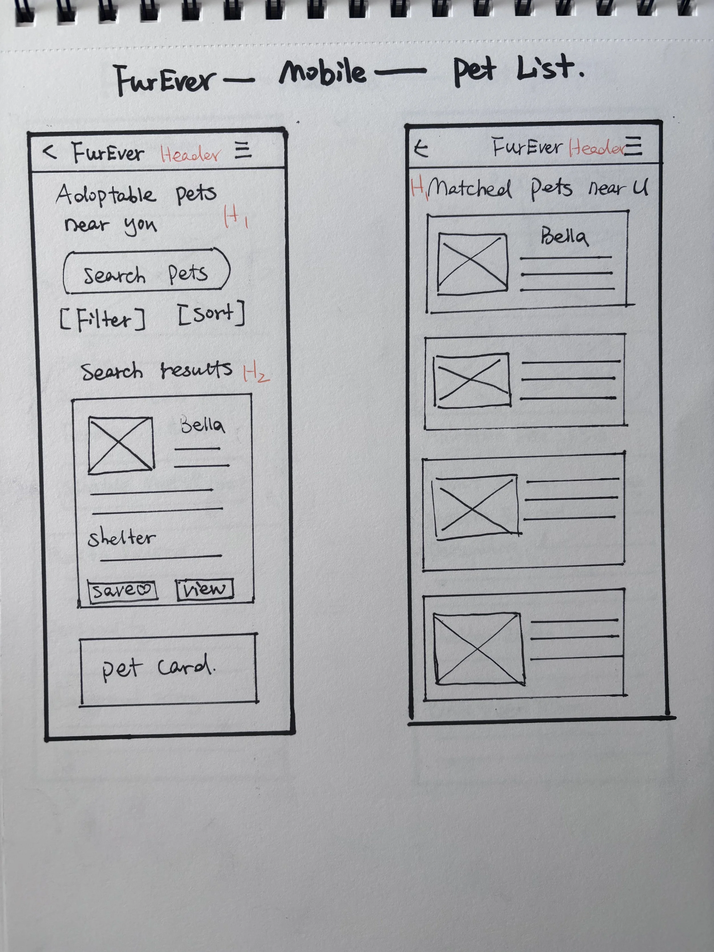
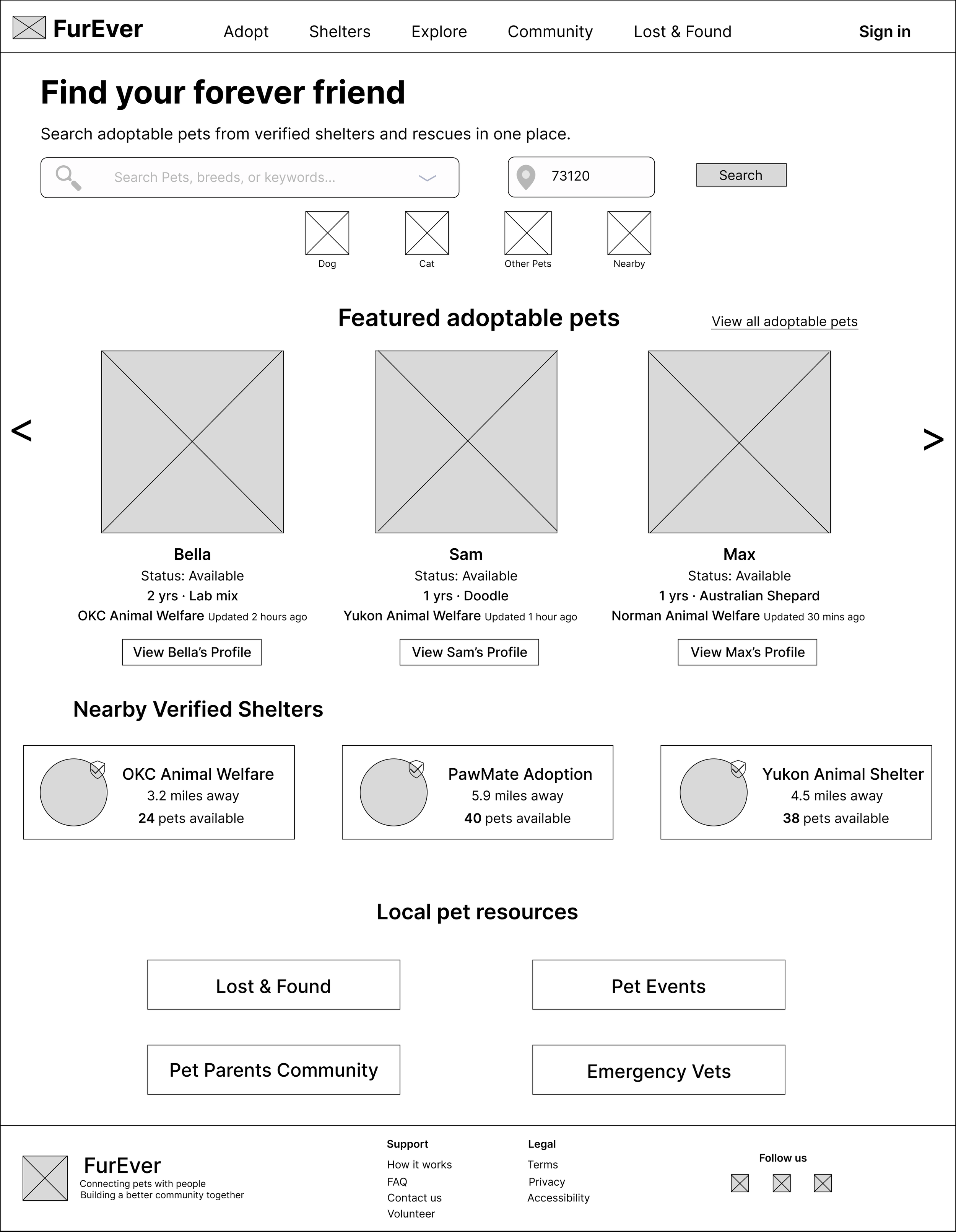
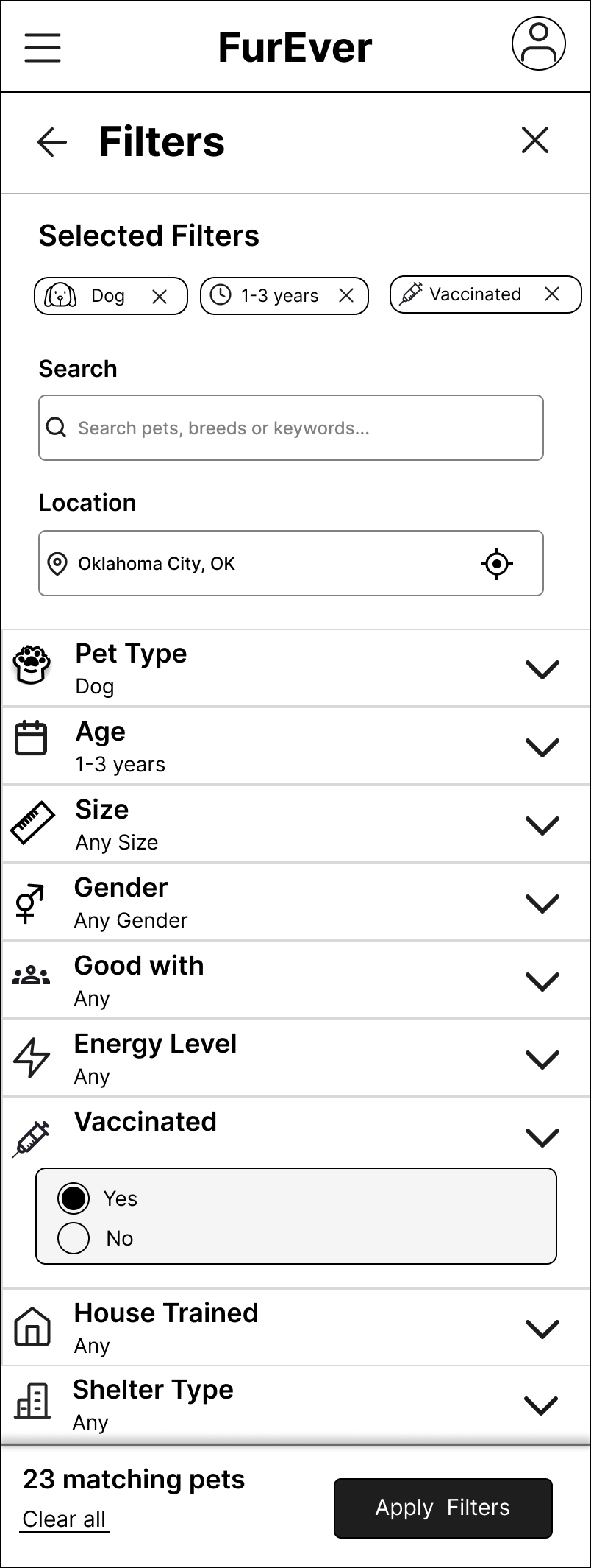
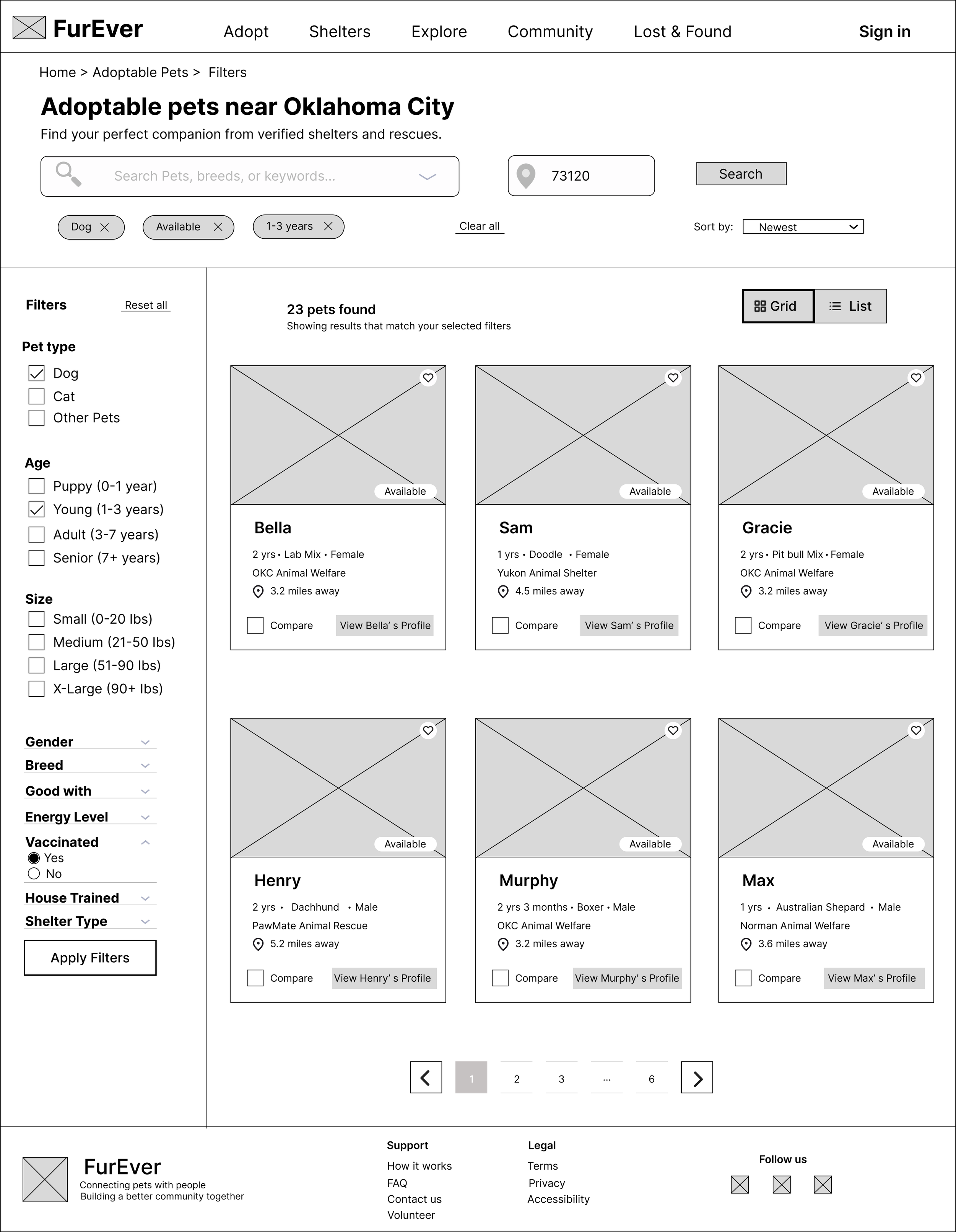
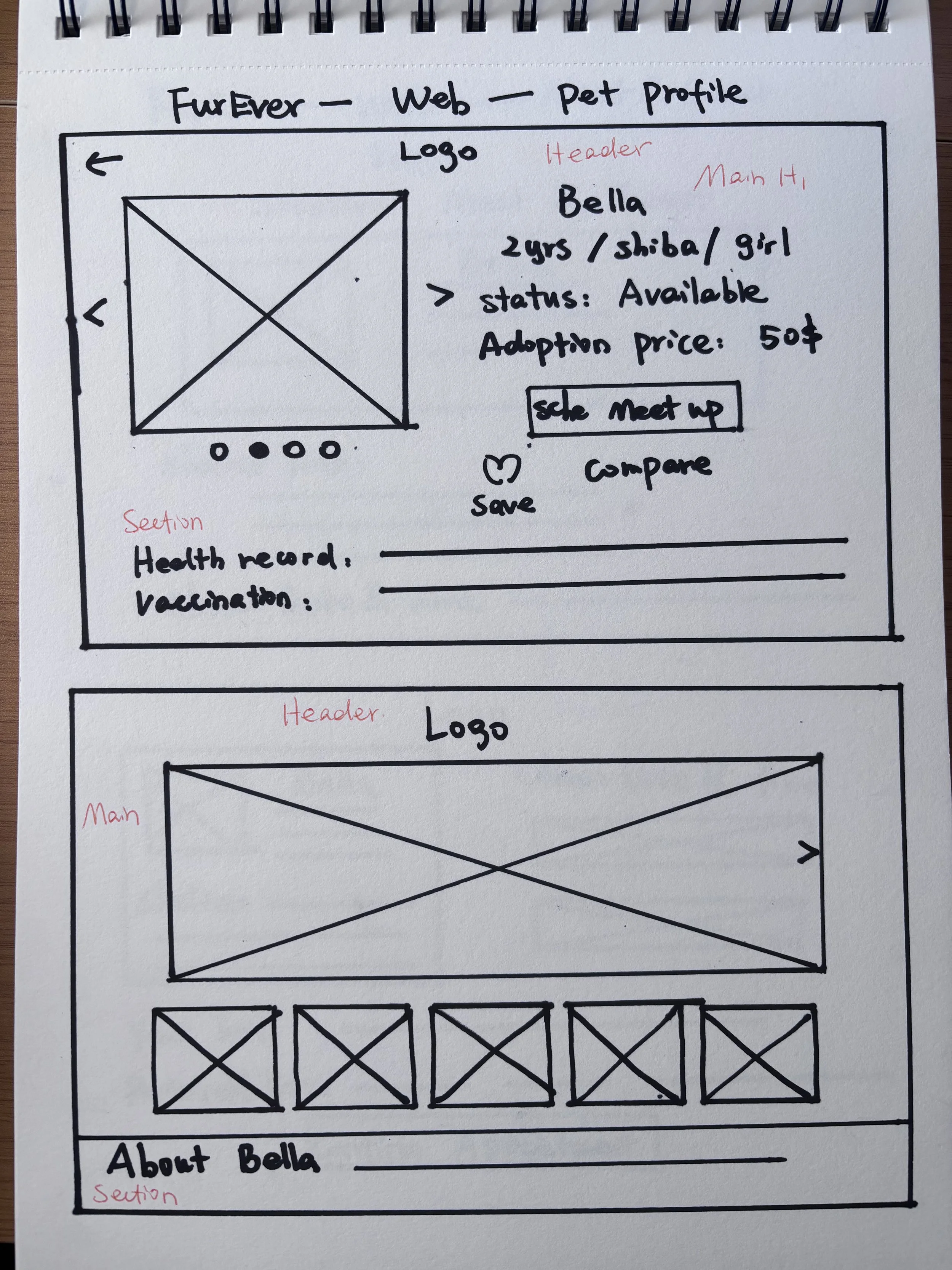
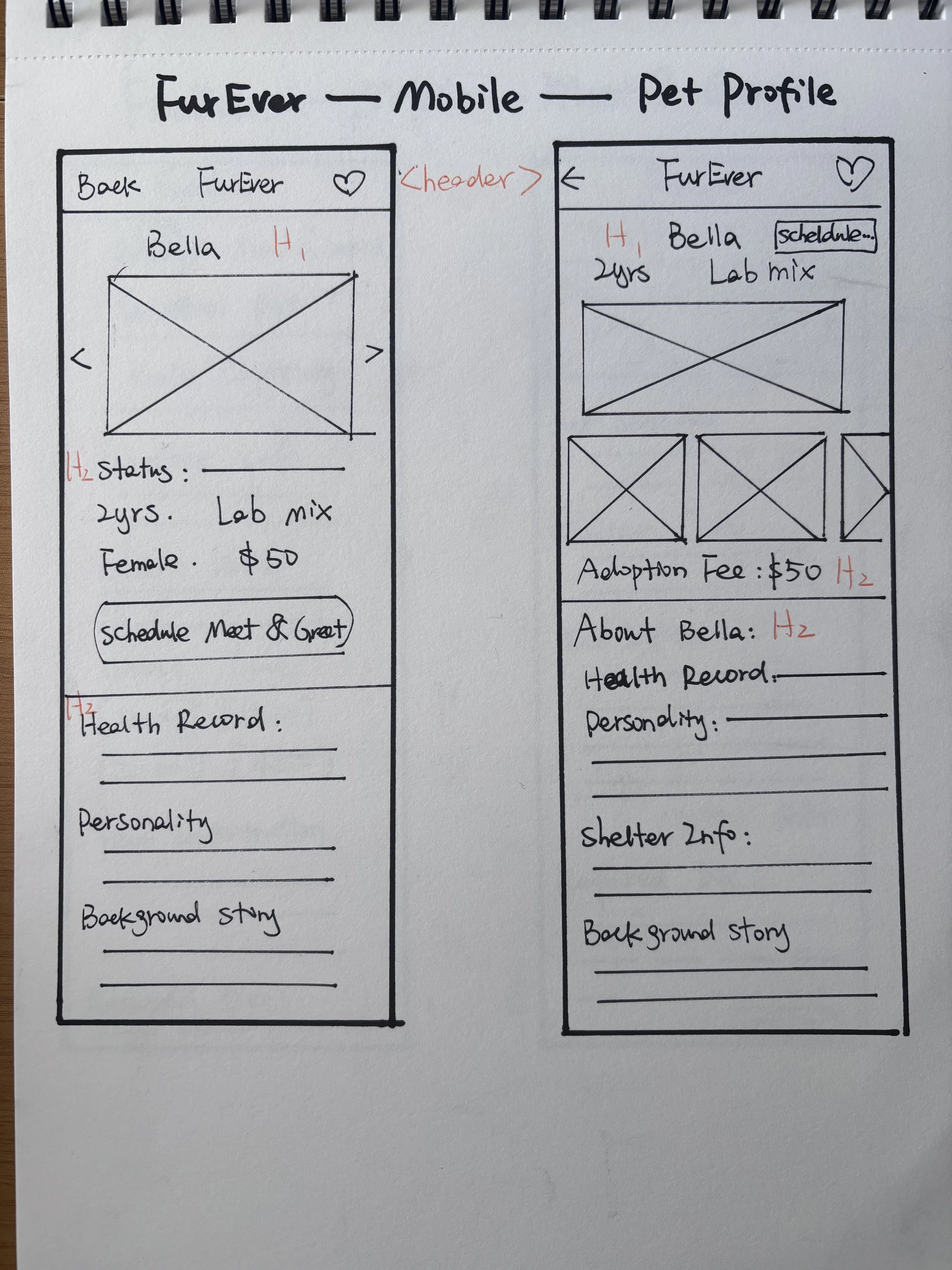
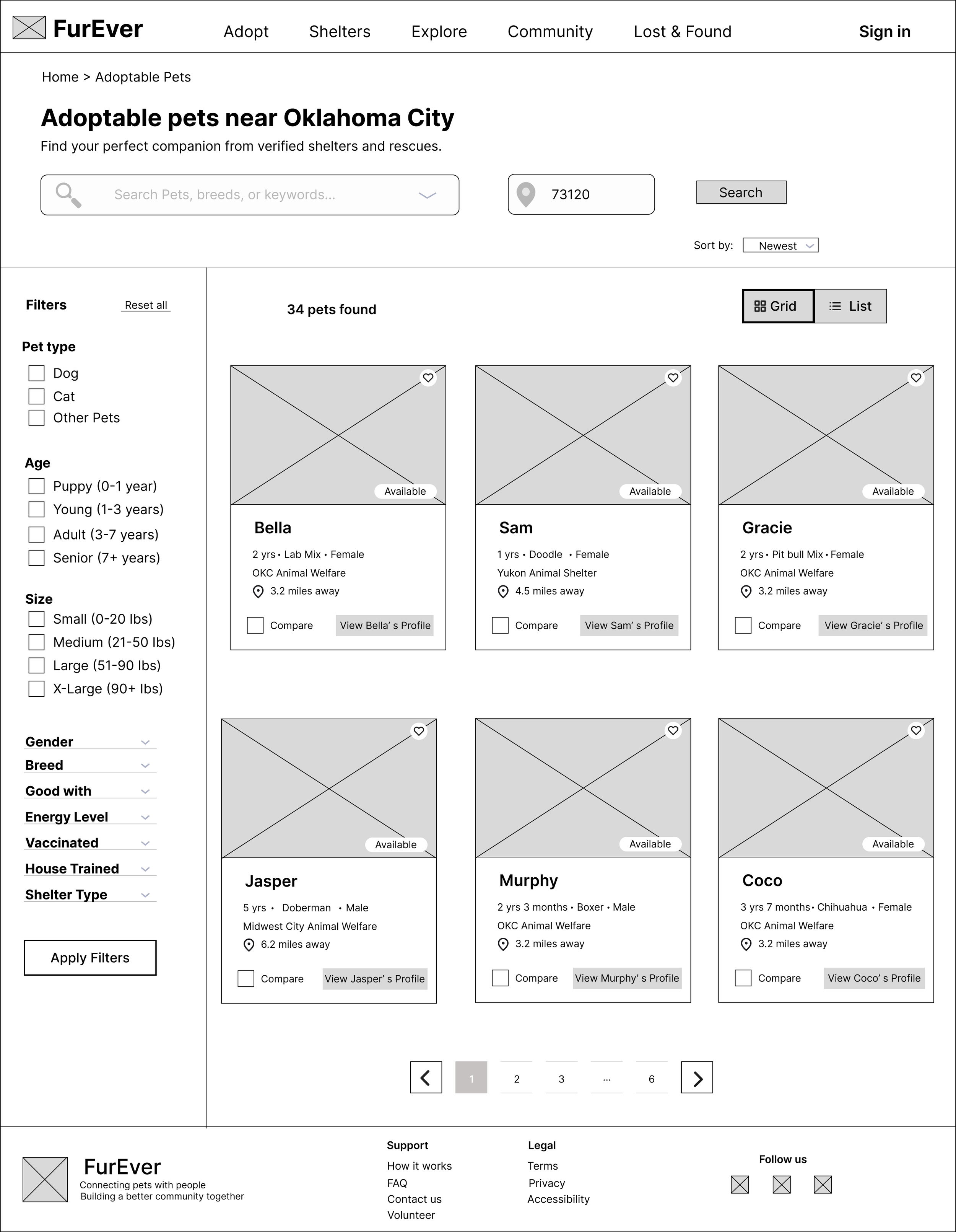
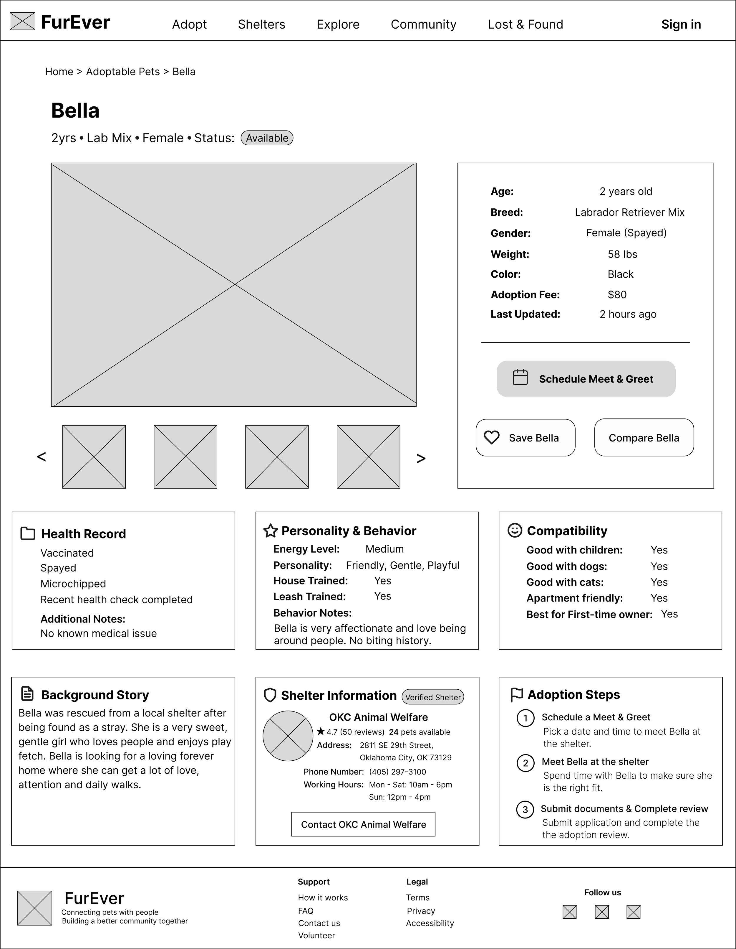
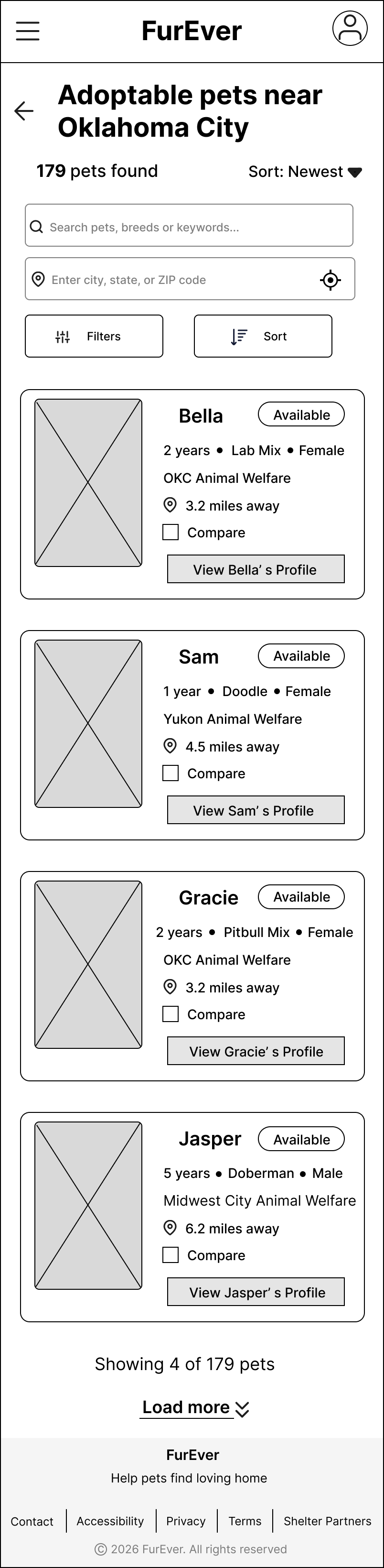
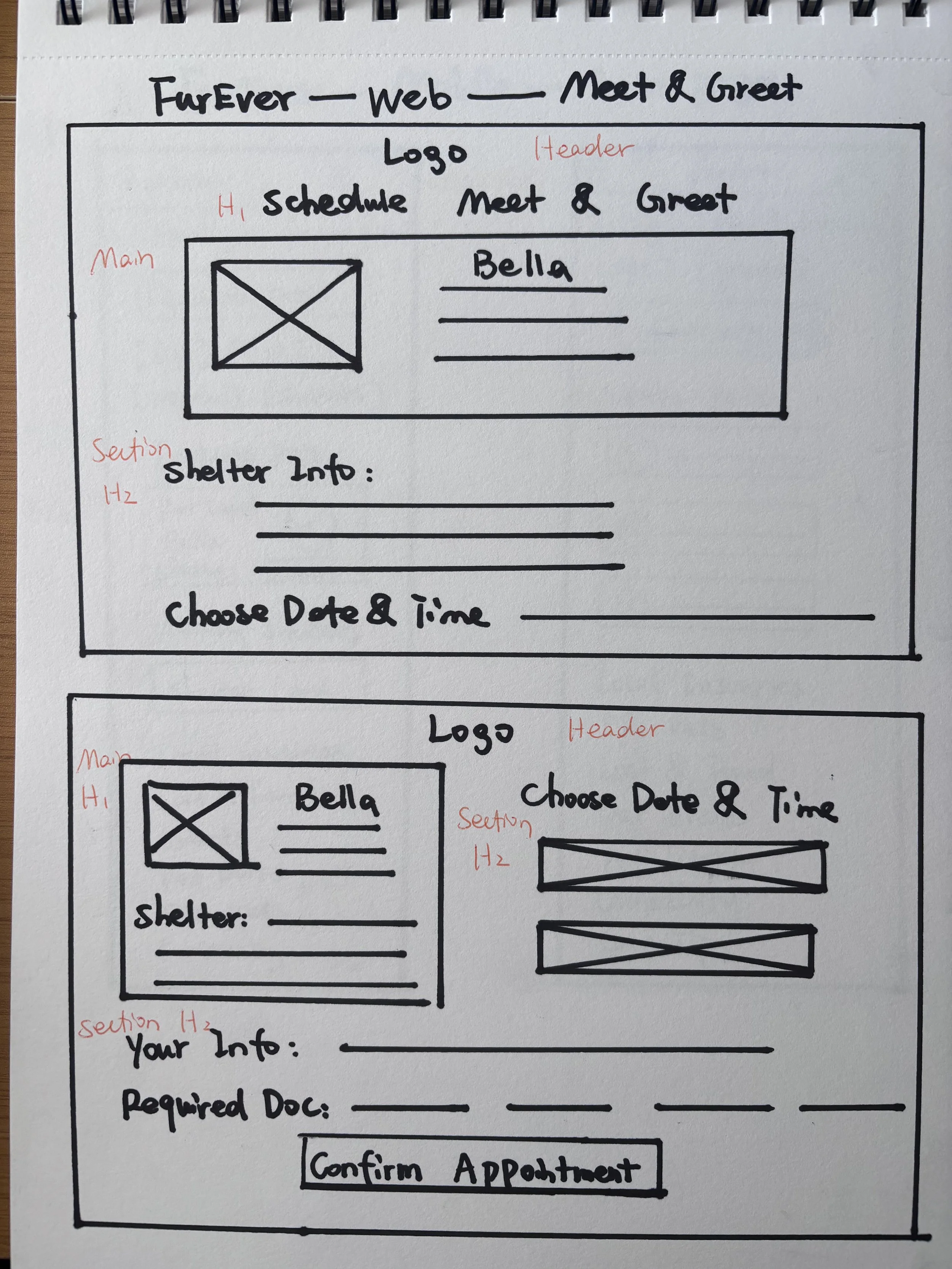
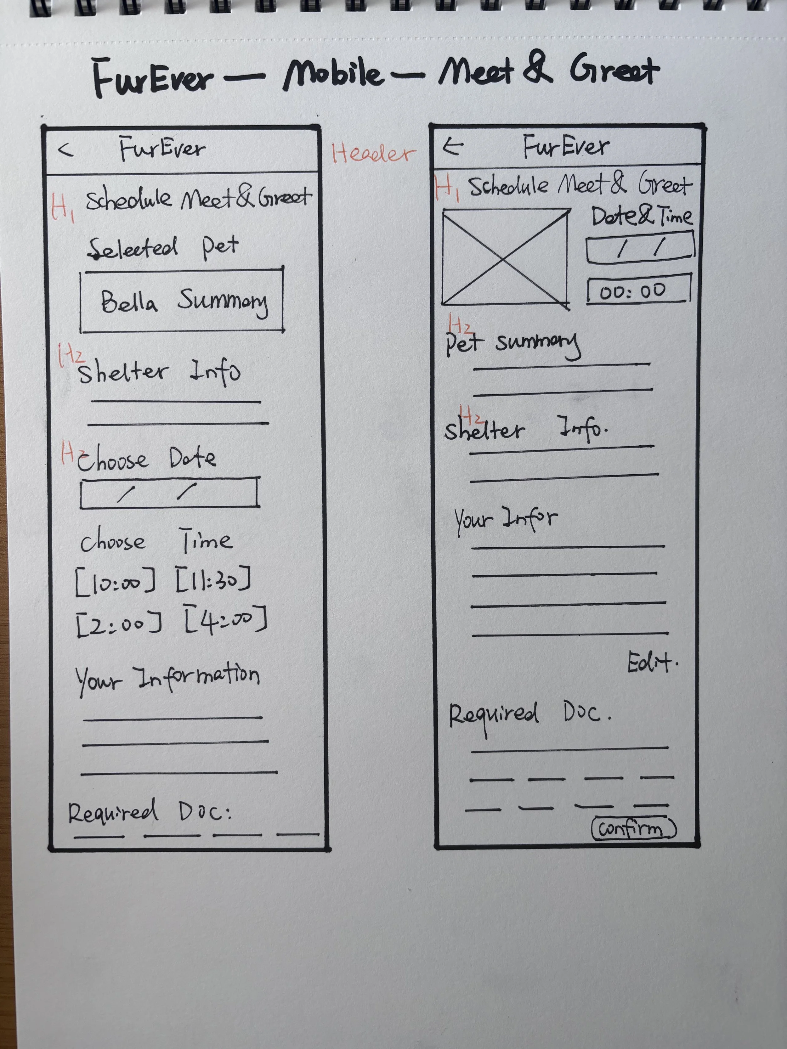
I translated the research and information architecture into low-fidelity wireframes for both desktop and mobile, focusing first on task flow, information hierarchy, and responsive behavior rather than visual styling.
1. Paper Wireframes
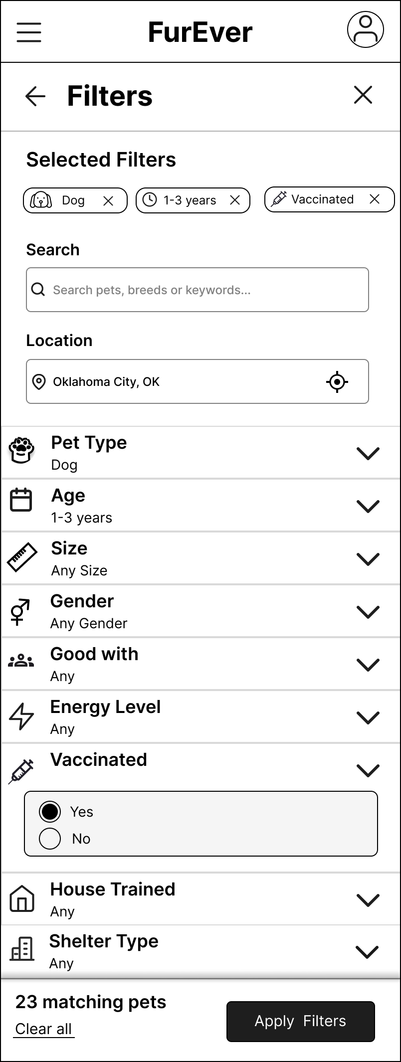
2. Digital Wireframes
Responsive Design Decision
On desktop, filters remain visible in a sidebar to support faster browsing and comparison. On mobile, the same functionality moves into a dedicated full-screen filter panel to preserve screen space while maintaining the same task flow.
Once the core flow was established, I connected the wireframes into an interactive prototype and tested it with users before moving into high-fidelity design.
Usability Testing
I conducted usability testing with 5 participants across both desktop and mobile prototypes. Participants were asked to find a vaccinated dog between 1–3 years old, review Bella’s profile, and schedule a meet-and-greet.
Tasks Tested
Search and filter pets · Review pet details · Schedule a meet-and-greet
Participants
5 users
Devices
Desktop + Mobile
01 — The core flow was easy to understand
Participants were able to move from pet discovery to scheduling without major navigation issues.
02 — Pet information was easy to evaluate
Health, compatibility, shelter, and availability information helped users decide whether they wanted to continue.
Design Iteration
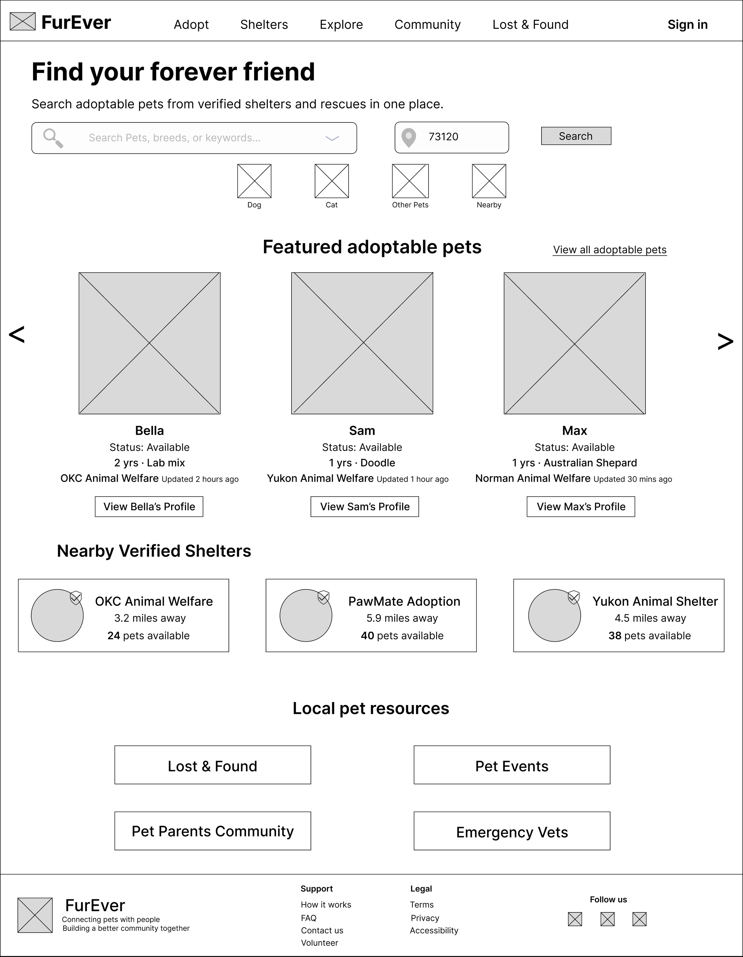
Before
The original homepage introduced several content areas immediately, making the first impression feel visually dense.
03 — The desktop homepage felt crowded
One participant felt that the first view of the desktop homepage presented too much information at once.
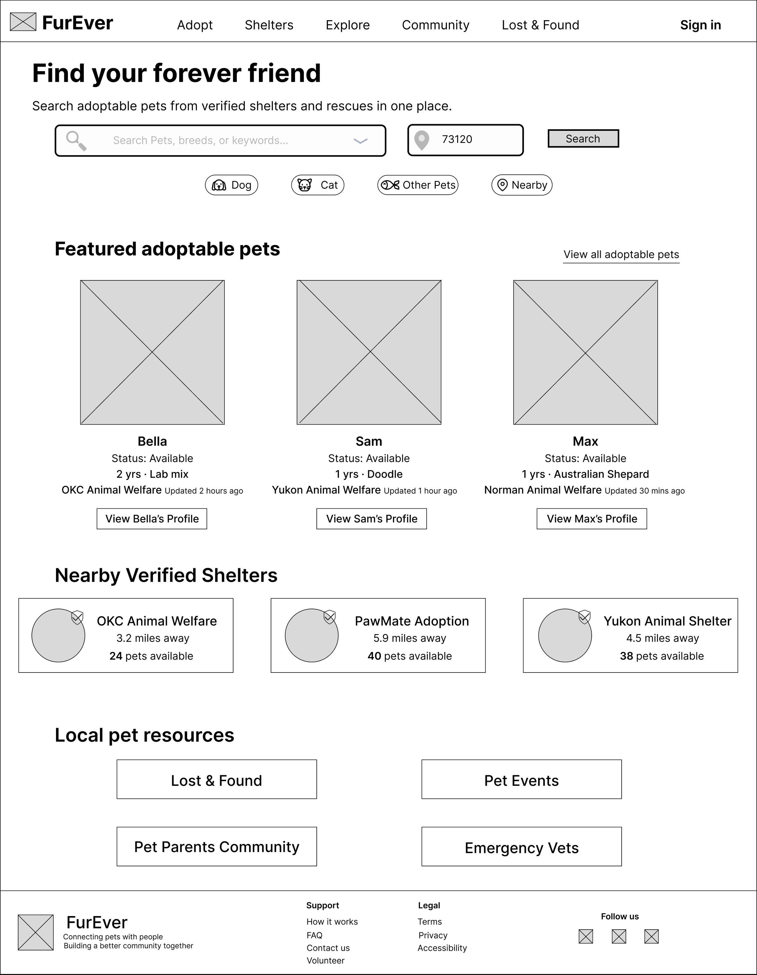
After
I refined the visual hierarchy, spacing, and content presentation to create a clearer entry point while keeping key discovery features accessible.
Result: The revised homepage creates a stronger visual hierarchy and gives users a clearer starting point for pet discovery.
High-Fidelity Solution
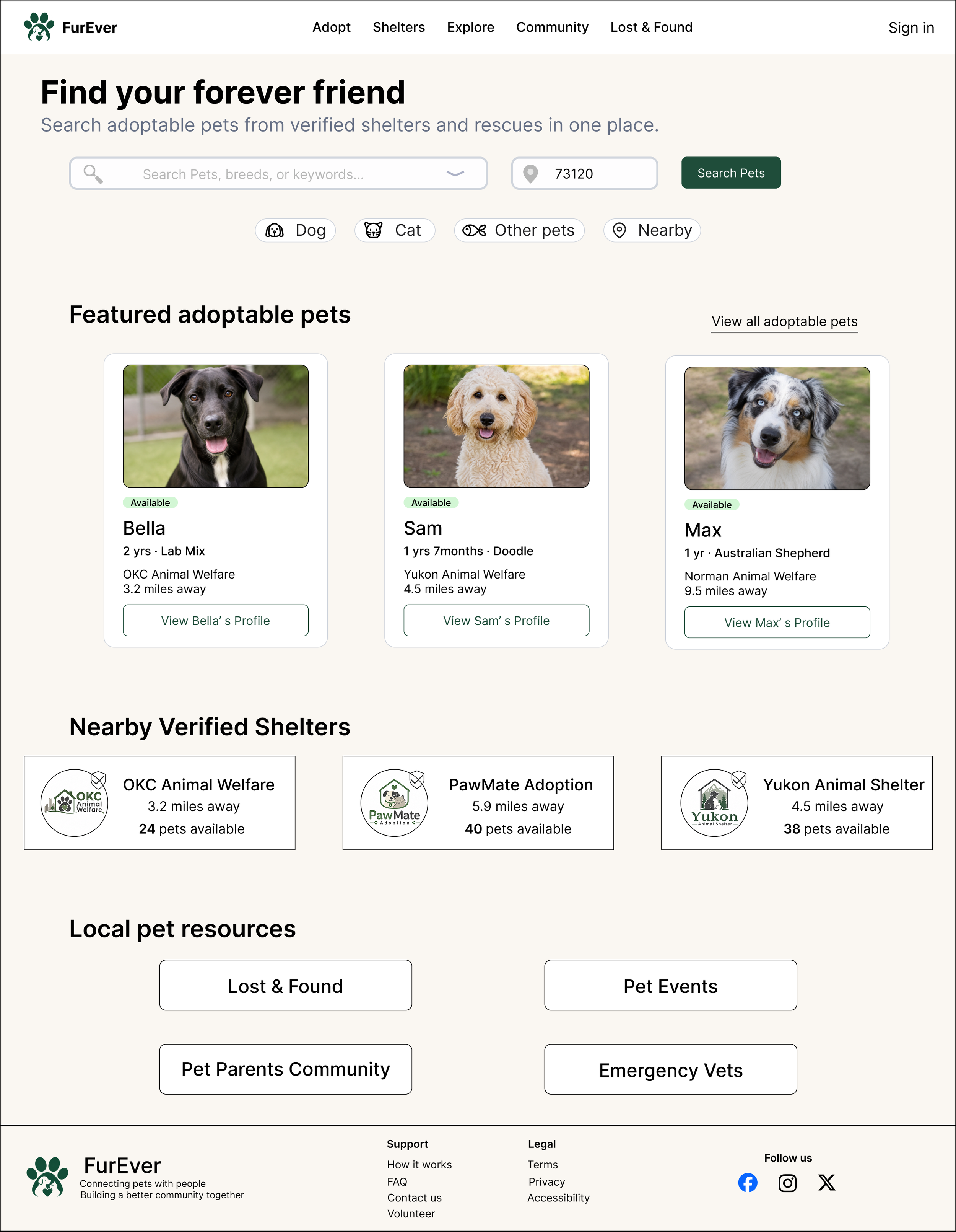
The final design brings pet discovery, evaluation, comparison, and meet-and-greet scheduling into one responsive experience across desktop and mobile.
1. Discover Pets
01 — Discover
01 — Pet Profile
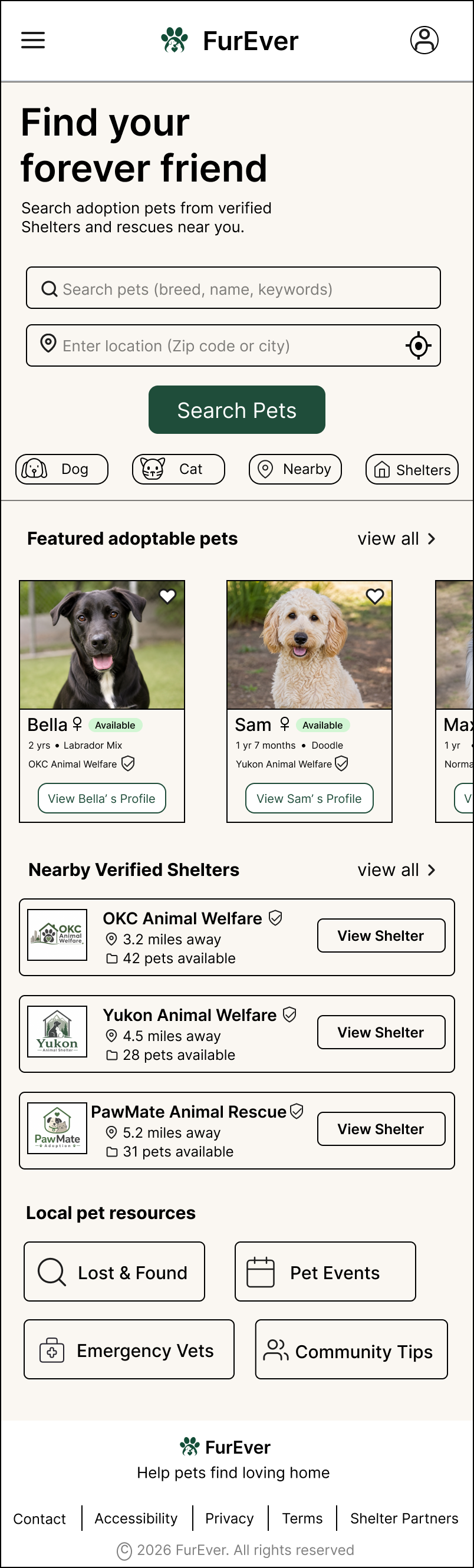
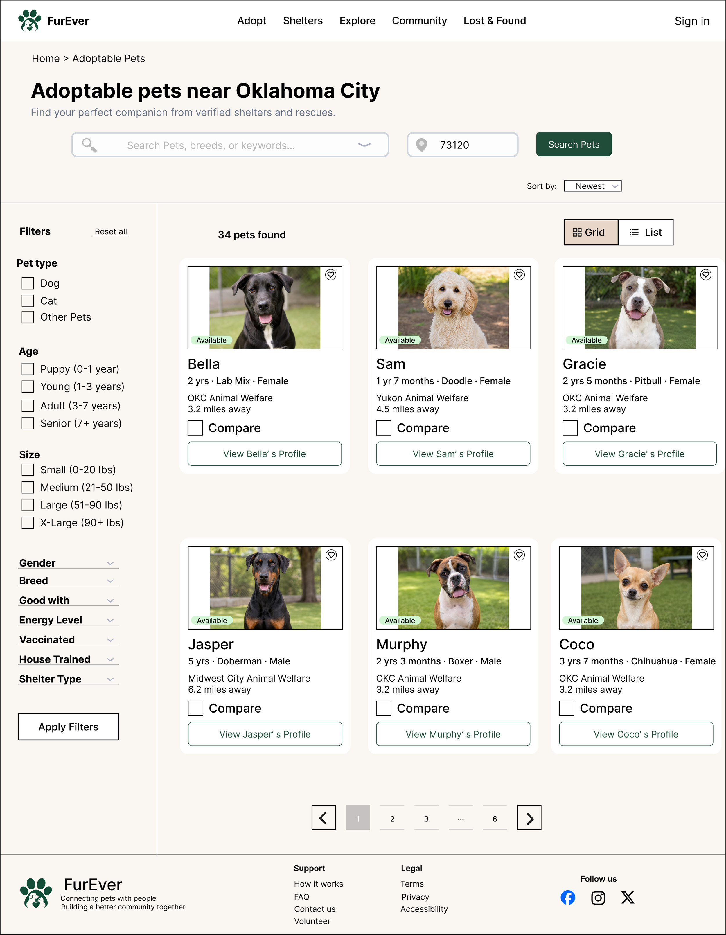
Users can quickly browse adoptable pets, search by location, and access verified shelters from the homepage. Responsive layouts preserve the same hierarchy while adapting navigation and content density for smaller screens.
2. Filter & Evaluate
02 — Find the Right Match
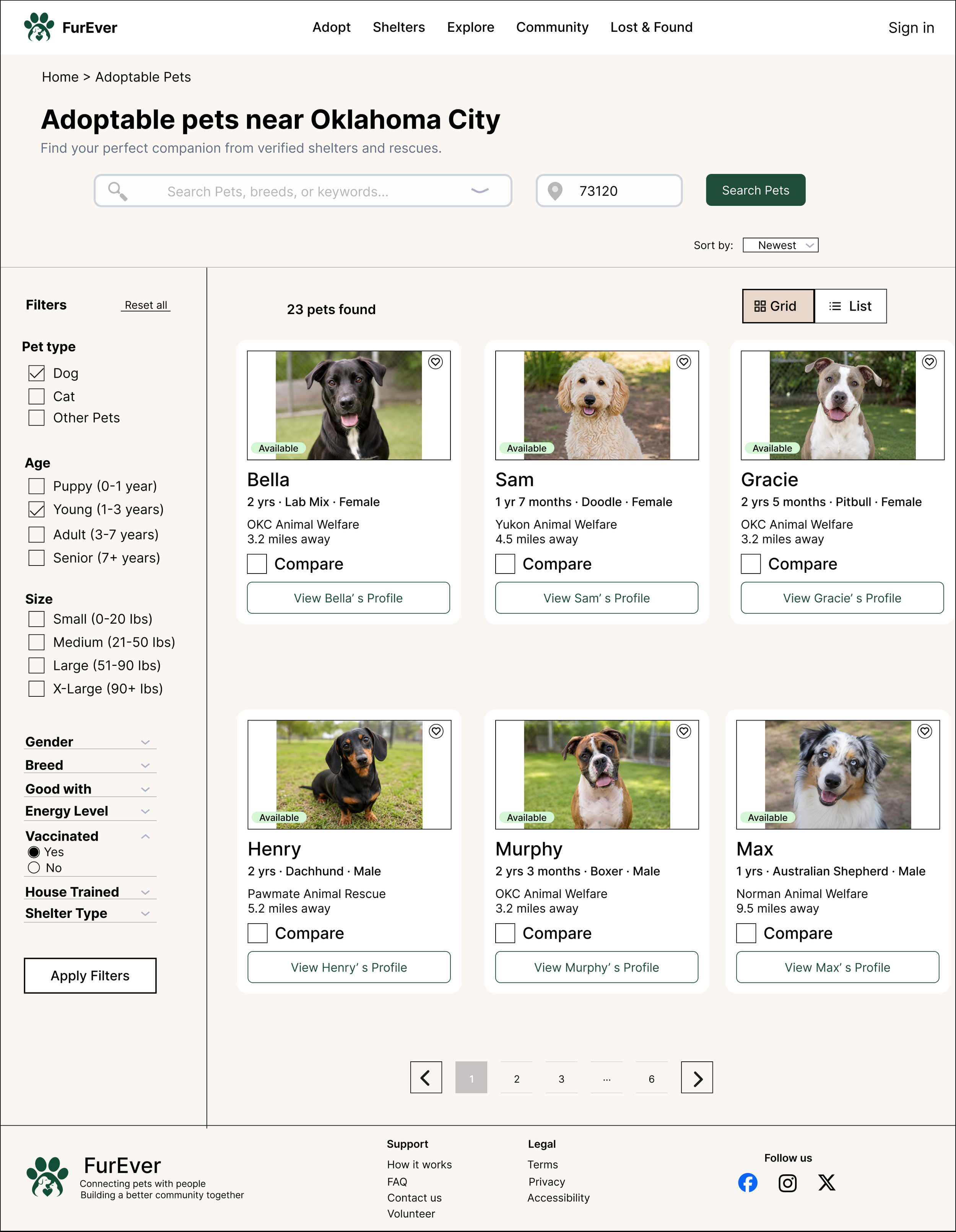
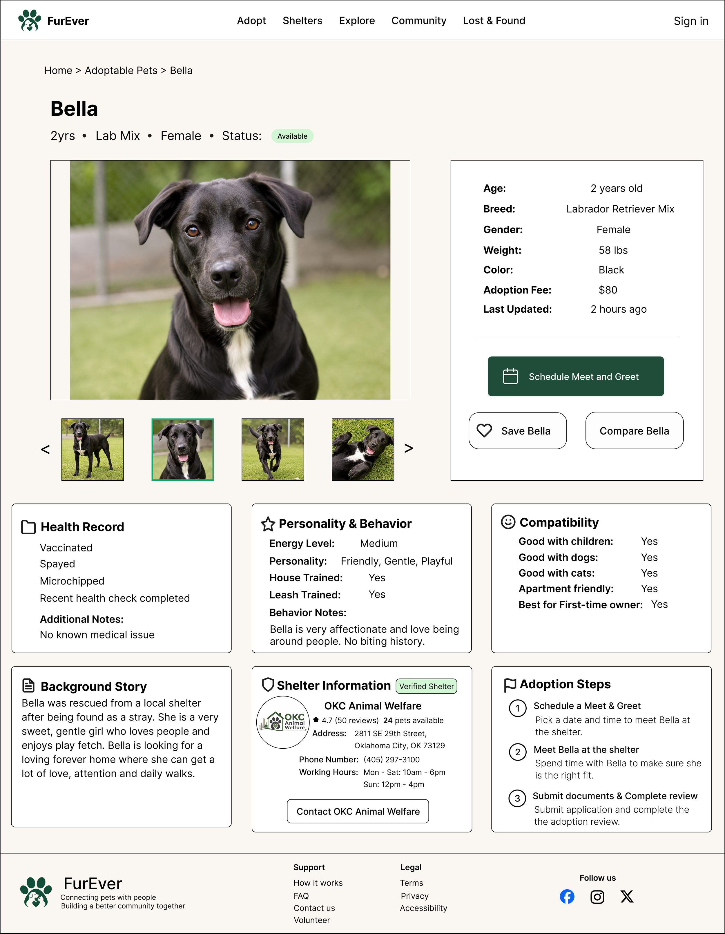
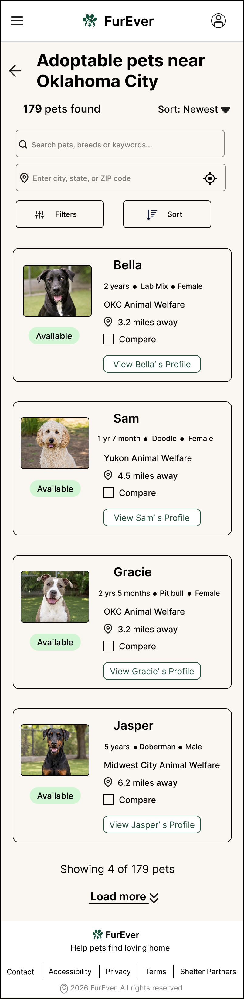
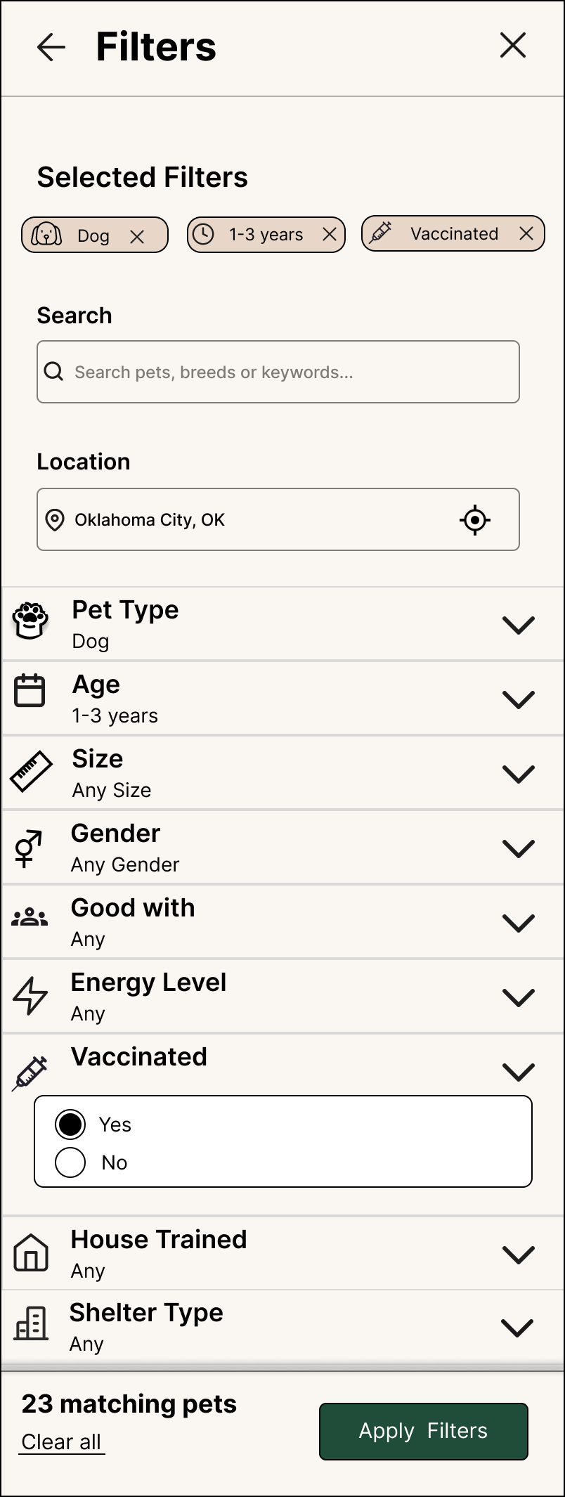
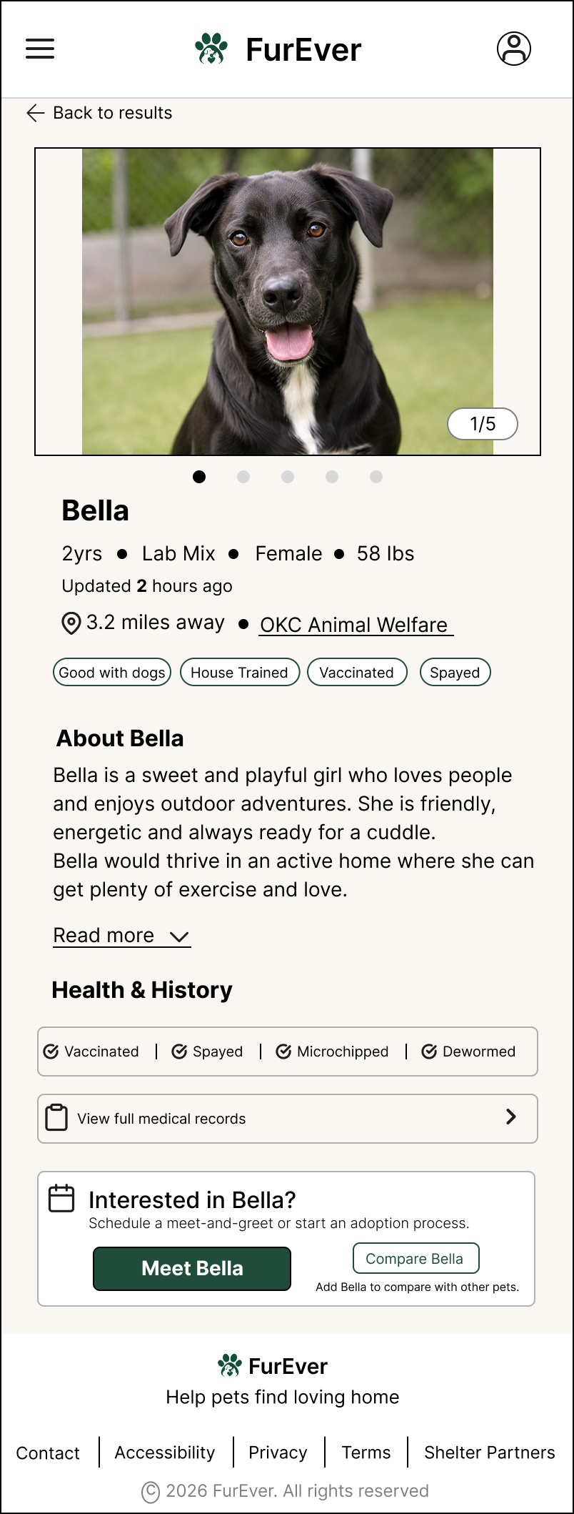
Filters help users narrow results by age, vaccination status, pet type, and other practical needs. Detailed pet profiles then provide health, compatibility, shelter, and availability information before users decide to move forward.
3. Compare With Confidence
03 — Compare
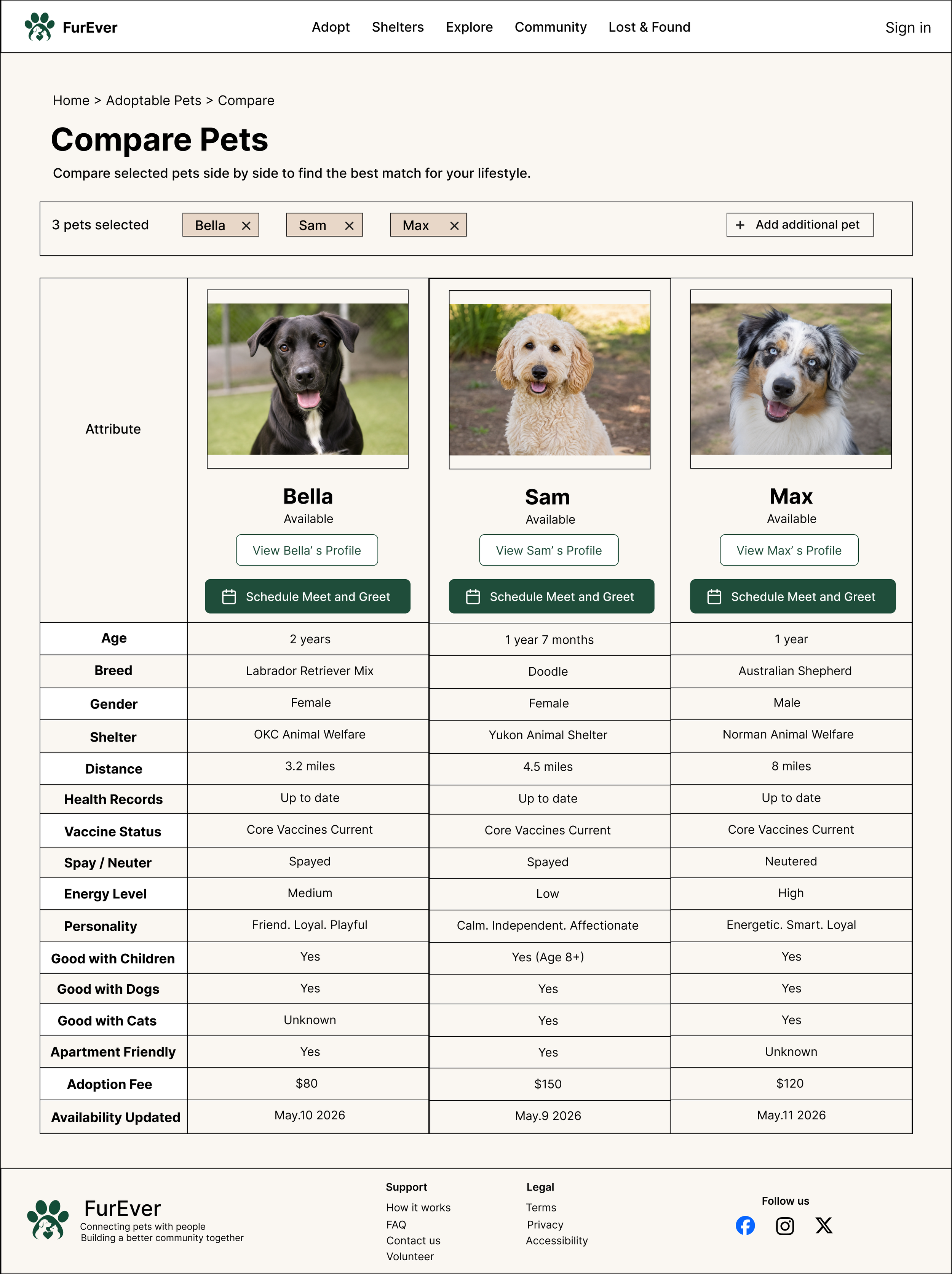
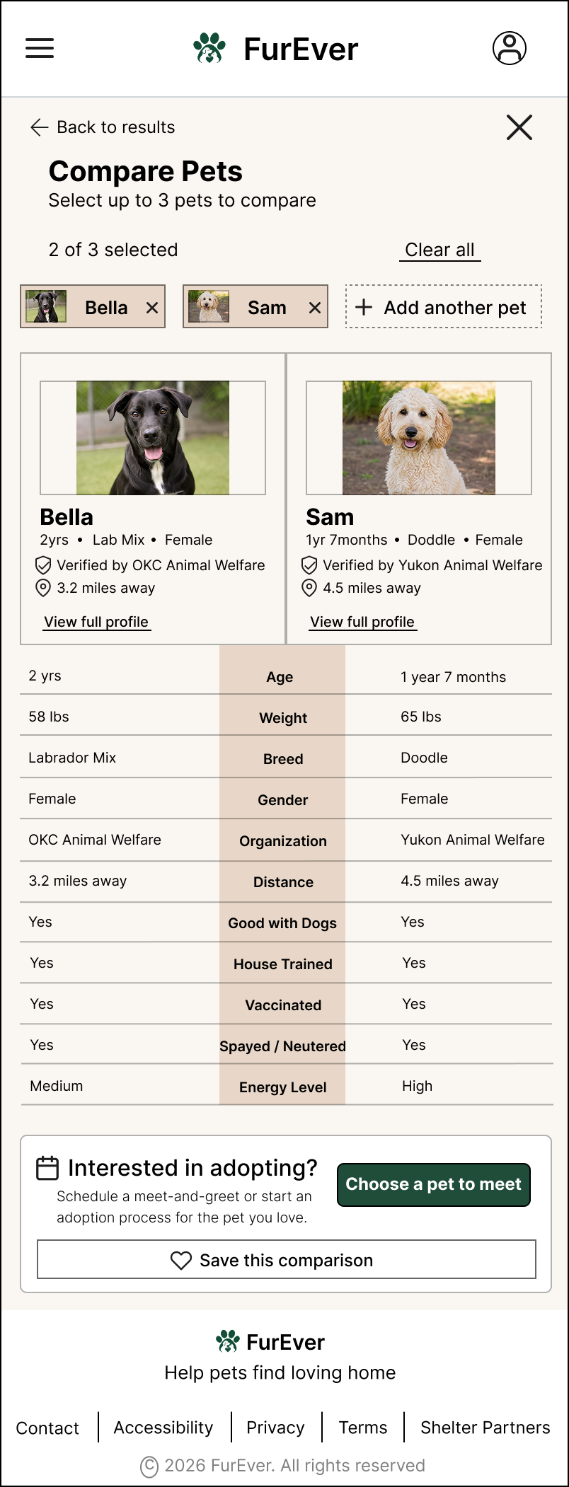
The comparison feature allows users to evaluate pets side by side using consistent criteria such as age, health, personality, compatibility, shelter, and adoption fee.
4. Move From Interest to Action
04 — Meet
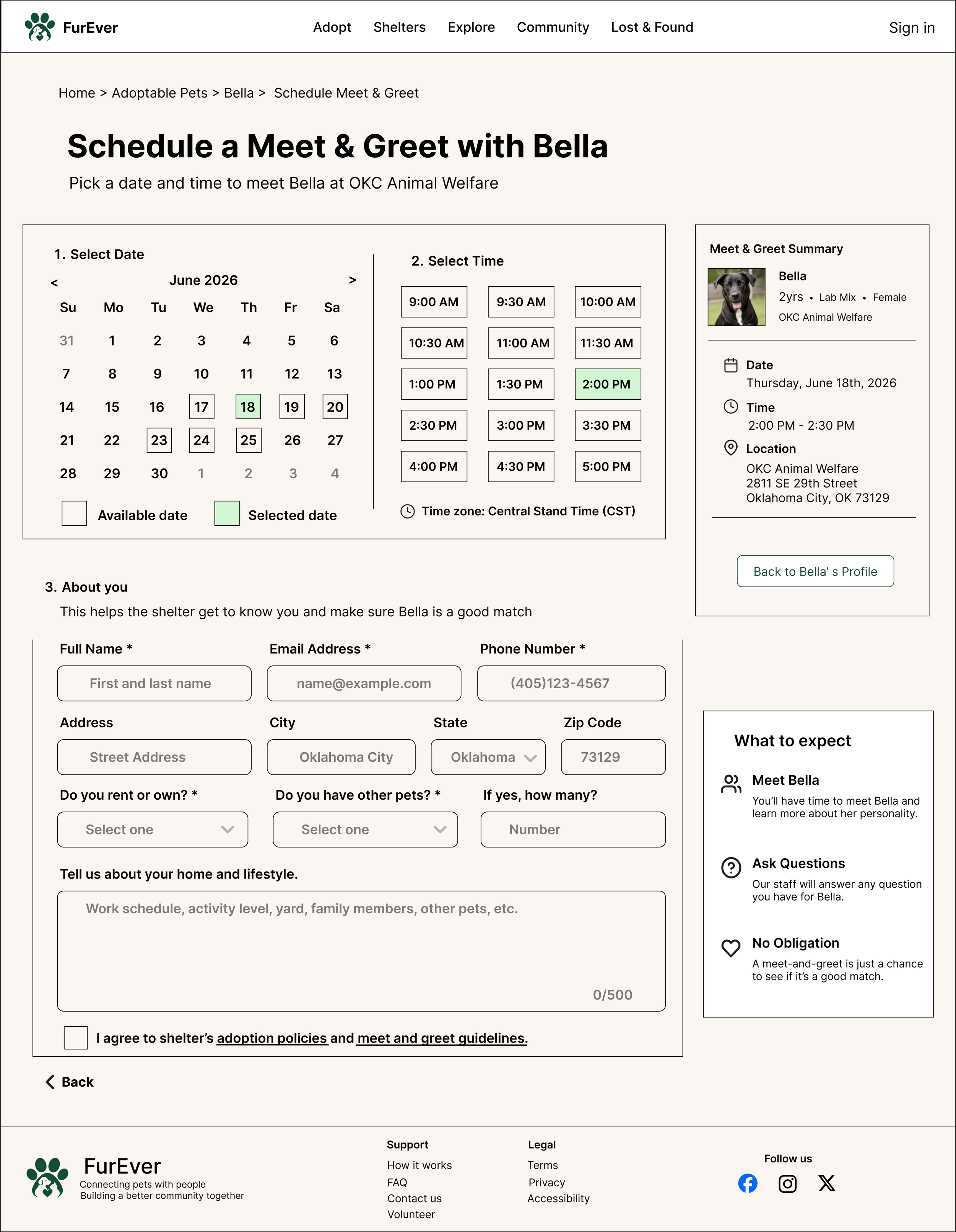
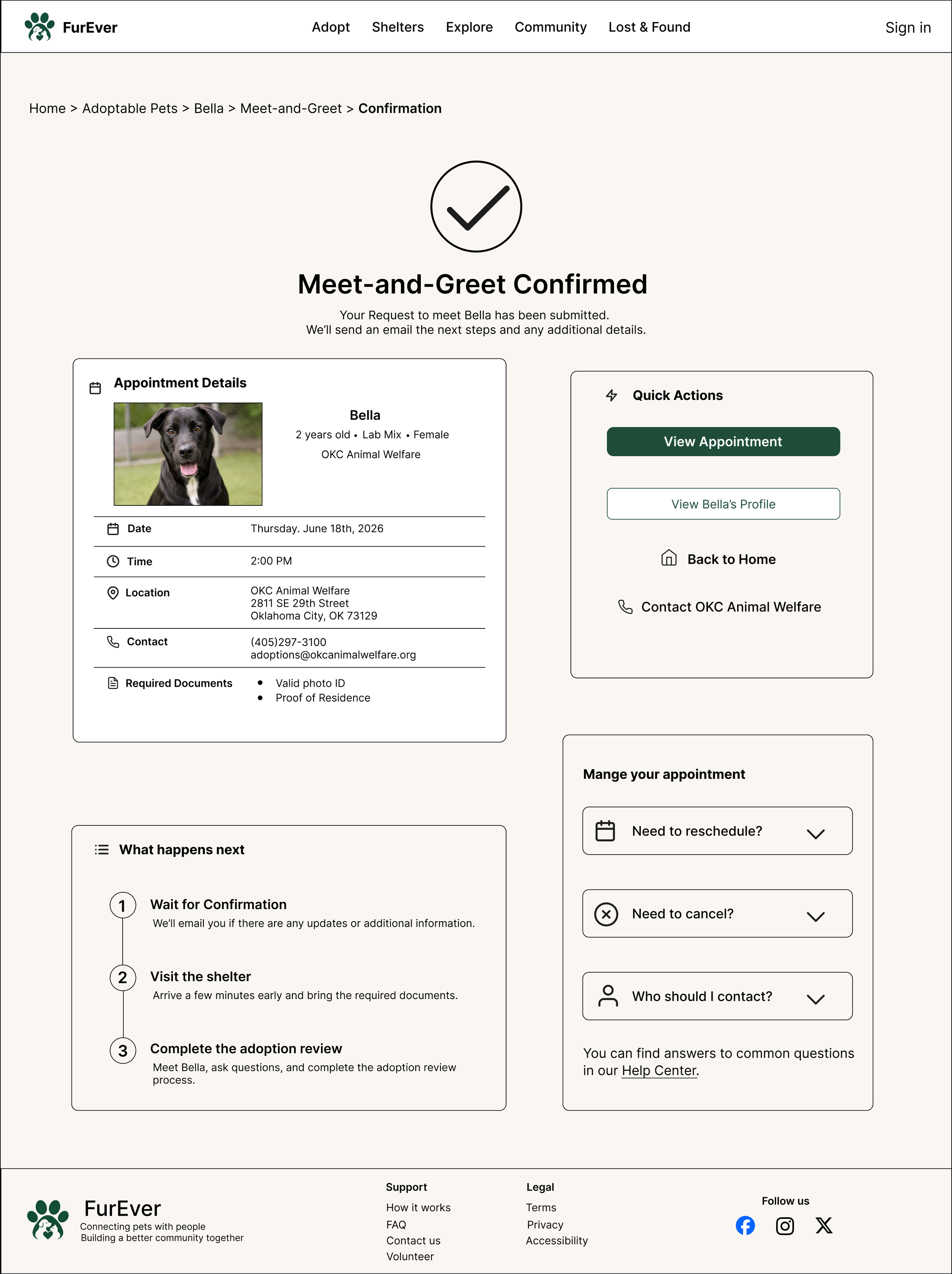
04 — Schedule Meet & Greet
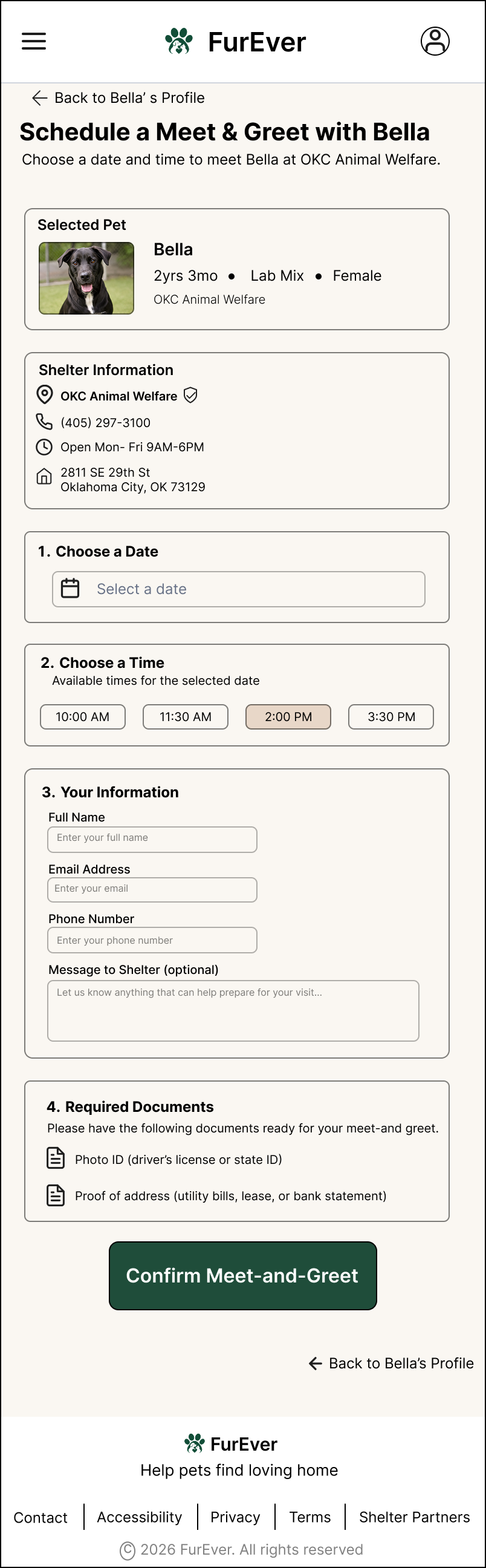
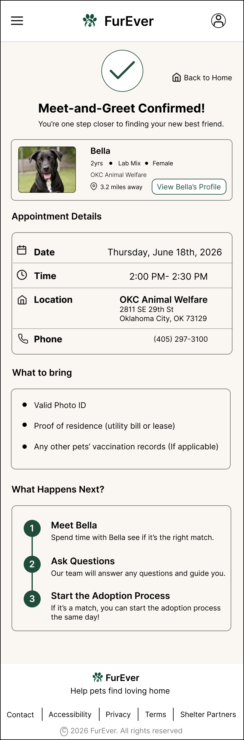
Once users find a potential match, they can schedule a meet-and-greet directly from the pet profile. The experience clearly communicates available times, required information, documents to bring, and what happens next.
Accessibility
Accessibility was considered throughout the responsive design process to ensure that users can navigate, understand, and complete key adoption tasks using different input methods and assistive technologies.
Clear Hierarchy
Semantic headings and consistent content structure help users understand each page and navigate efficiently.
Accessible Controls
Buttons, filters, form fields, accordions, and comparison controls use descriptive labels and clear interaction states.
More Than Color
Availability, selected filters, validation, and other important states are communicated through text and structure rather than color alone.
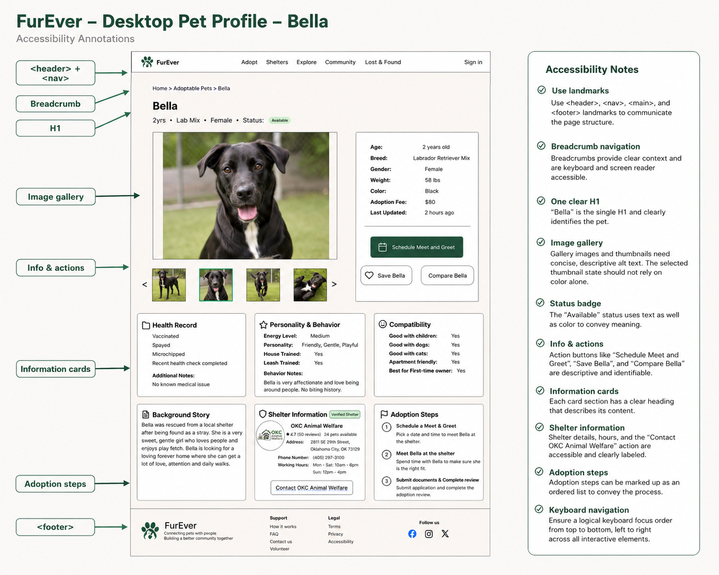
Accessible Pet Information
Pet status, image gallery controls, health information, expandable content, and primary actions were designed with descriptive labels, clear hierarchy, and logical focus order.
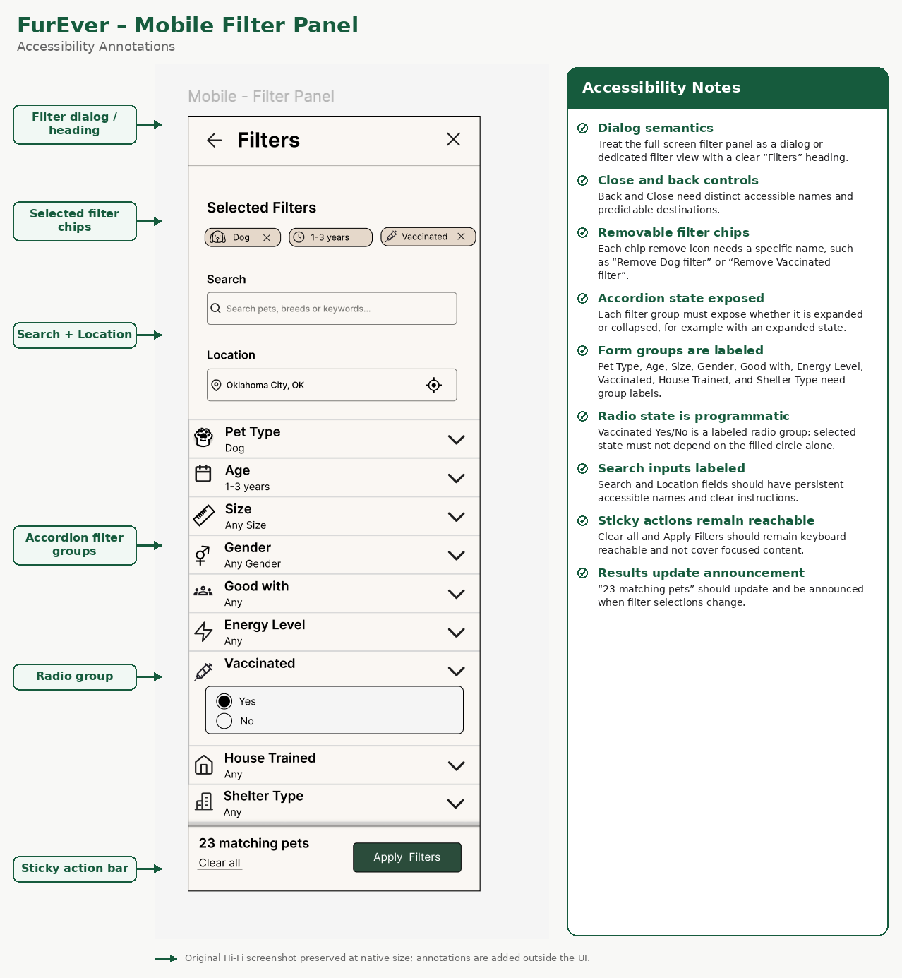
02 — Filter Experience
Accessible Filtering
Filter groups use clear labels, expandable sections, removable filter chips, and programmatic selected states. Matching result counts can also be announced when filters change.
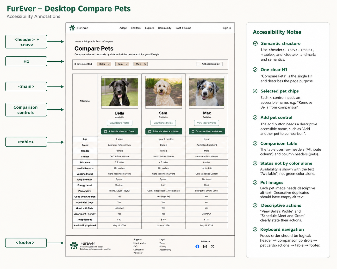
03 — Compare Pets
Accessible Comparison
Comparison content is structured so row and column relationships remain understandable beyond the visual table, while pet-specific controls use descriptive accessible names.
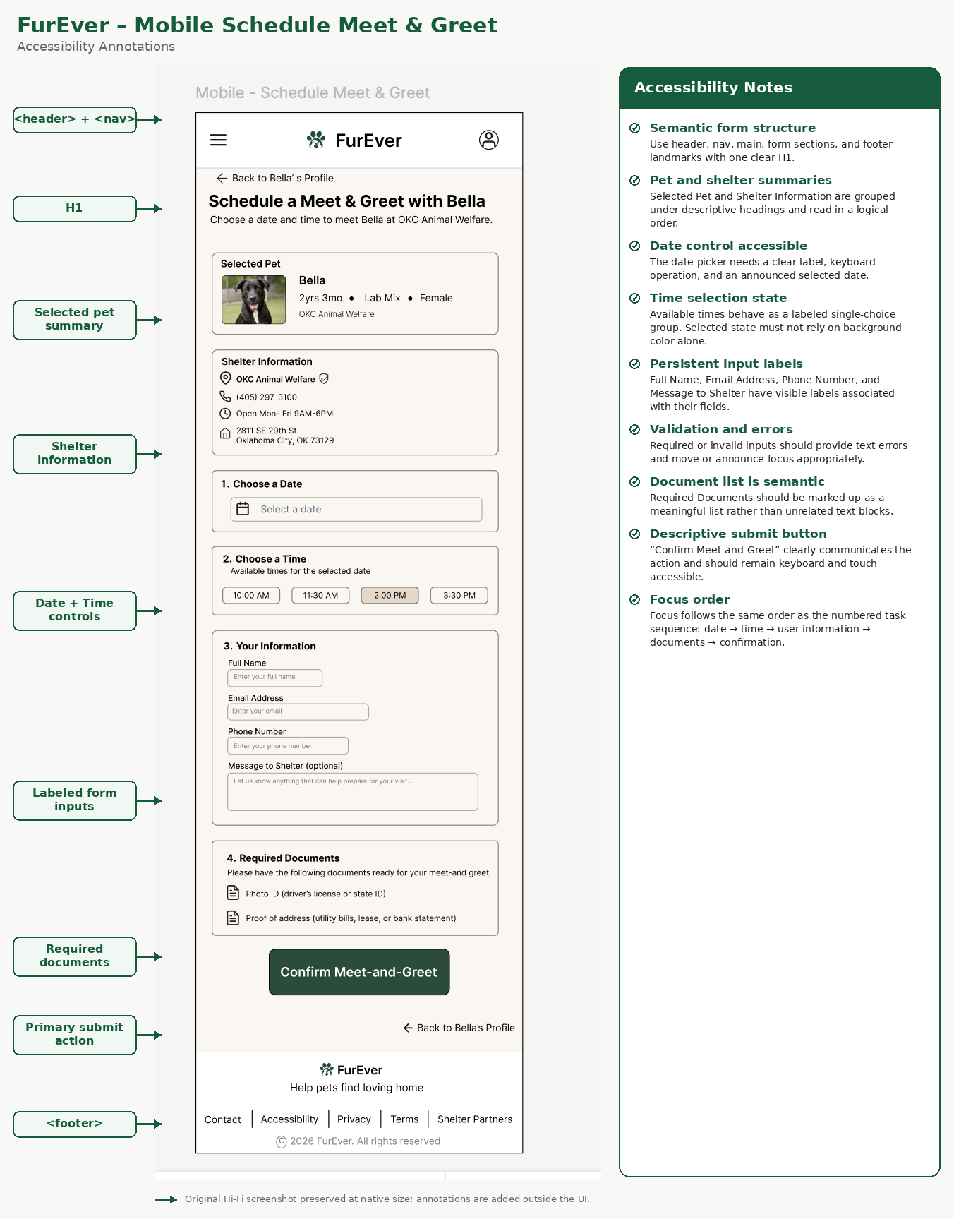
Accessible Forms
Form fields retain visible labels, time options communicate their selected state beyond color, validation messages are connected to their fields, and the focus sequence follows the natural task order.
Keyboard & Screen Reader Support
Logical focus order, descriptive accessible names, form labels, and semantic grouping support keyboard and assistive technology use.
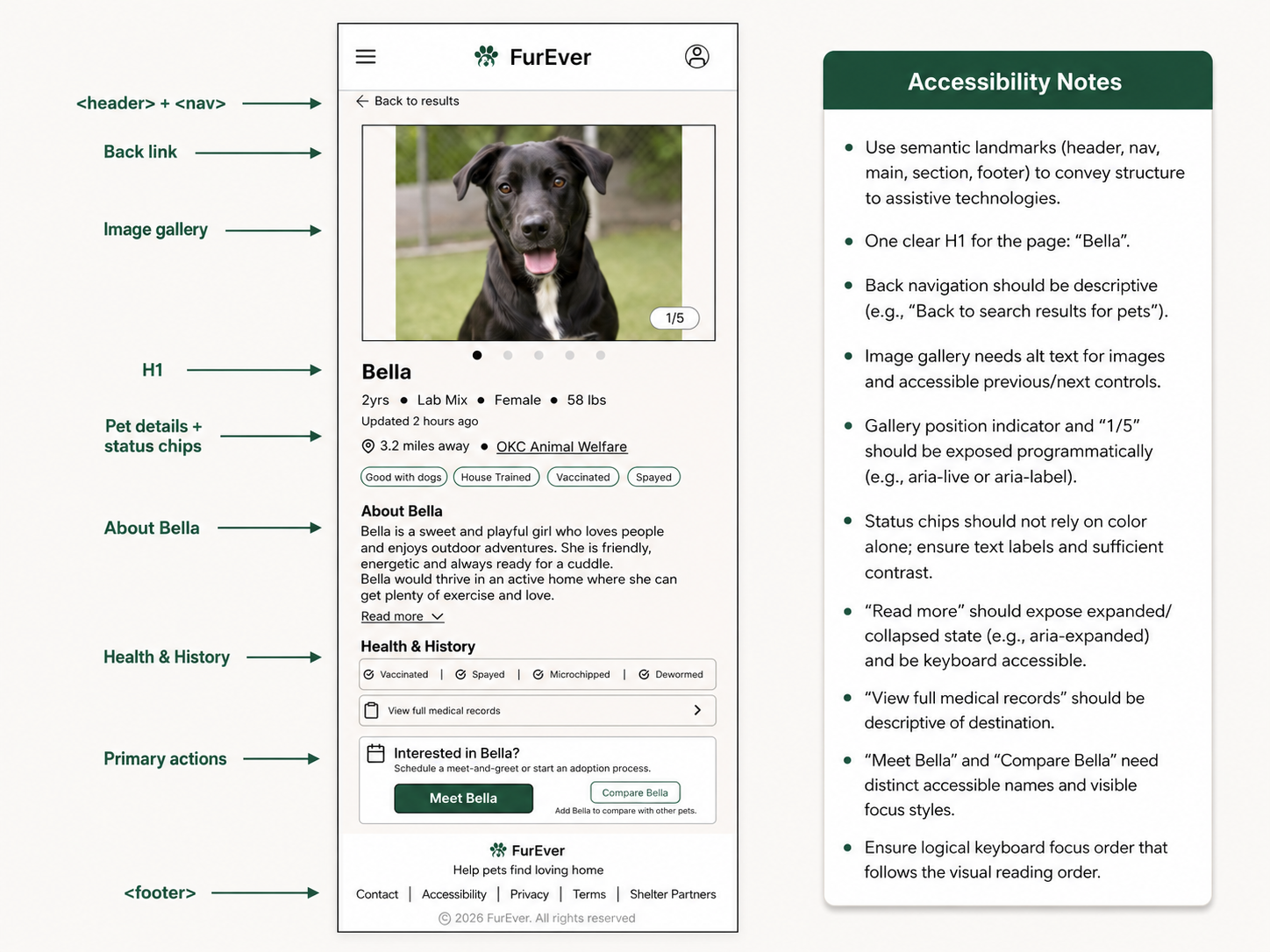
Accessibility takeaway: Designing for accessibility improved more than assistive technology support—it also created clearer labels, stronger hierarchy, more understandable interaction states, and a more predictable experience for everyone.
Interactive Prototype
I connected the final desktop and mobile screens into interactive prototypes to demonstrate the complete adoption journey from discovery to meet-and-greet confirmation.
Reflection & Key Takeaways
Reflection
FurEver helped me strengthen my approach to responsive product design by thinking beyond screen size and focusing on how information, navigation, and interactions should adapt across devices. User testing also reinforced the importance of simplifying dense information and making the adoption process feel clear and predictable.
Key Takeaways:
01 — Responsive means adapting, not shrinking
Desktop and mobile layouts required different approaches to navigation, filtering, content density, and interaction patterns while maintaining the same core experience.
02 — Trust is part of the user experience
Verified shelter information, health records, compatibility details, and clear availability help users feel more confident before taking the next step.
03 — Accessibility improves usability for everyone
Clear hierarchy, descriptive labels, visible states, logical focus order, and accessible forms made the experience easier to understand overall.
What I’d explore next:
If the product continued, I would test the experience with a larger participant group, explore shelter-side management tools, and validate the comparison and scheduling features with real adoption organizations.